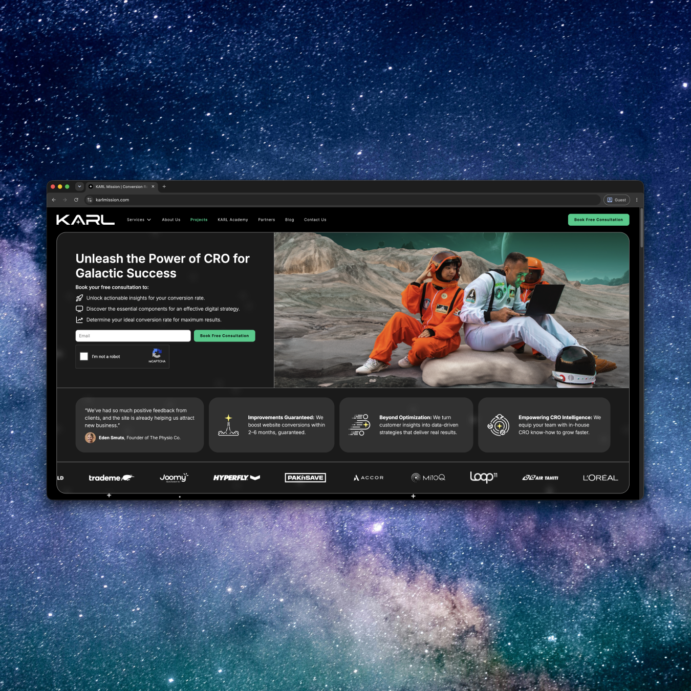
Above the fold optimization is the process of structuring the first visible screen of a webpage, before any scrolling, so it communicates value, builds trust, and prompts action within seconds. It covers the layout, messaging, and technical performance of that initial view: headline, visual hierarchy, call to action placement, social proof, and load speed. Done well, it turns a webpage's first impression into a measurable conversion driver rather than a design afterthought.
This guide treats the first screen as a system with moving parts, not a checklist of design trends. If you already have traffic and you are losing it in the first three seconds, this is where to start.
Why the First Screen Decides Everything
The first screen decides everything because visitors judge a page before they read it. Research from Carleton University found that people form a lasting opinion about a website's visual appeal in as little as 50 milliseconds. That judgment happens before anyone reads a headline or scans a feature list.
What people see in that instant matters disproportionately. Nielsen Norman Group's eye-tracking research on scrolling behavior found that users spend roughly 80 percent of their viewing time on content above the fold, with attention dropping off sharply once they scroll past it. That does not mean visitors never scroll. It means what they see first sets the expectation for whether scrolling is worth their time.
Speed compounds this. Google's mobile performance research found that the probability of a visitor bouncing increases by 32 percent as load time goes from one second to three seconds. If your hero section takes too long to render, none of your messaging or design work gets seen at all. This is the first screen bounce rate problem in one sentence: a slow, unclear, or cluttered first screen does not get a second chance, no matter how strong the rest of the page is.
What Makes an Above the Fold Section Convert
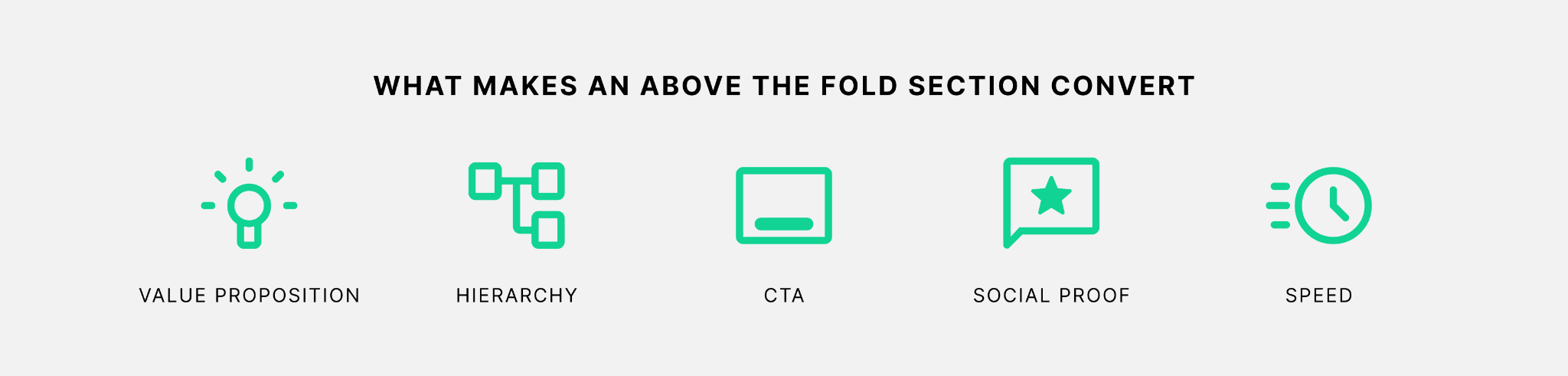
An above the fold section converts when five elements work together: a clear value proposition, a deliberate visual hierarchy, a visible call to action, immediate social proof, and fast load speed. None of these work in isolation. A strong headline with a slow-loading hero video still loses visitors. A fast page with a vague value proposition still fails to convert the visitors it keeps.
Value proposition is the single sentence that tells a visitor what you do, who it is for, and why it matters, without requiring them to infer anything. Visual hierarchy is the deliberate use of size, contrast, and spacing so the eye lands on the value proposition first, then the CTA, in that order. CTA placement means the primary action is visible without scrolling on the devices your traffic actually uses. Social proof at this stage is lightweight: a rating, a client logo, a number, not a full testimonial block. Speed is measured by Core Web Vitals, specifically Largest Contentful Paint, which Google recommends keeping under 2.5 seconds for a good user experience.
These five elements are also where our UX and UI design work tends to start when we audit a landing page, because most conversion problems above the fold trace back to one of them being missing or working against the others.
10 Above the Fold Optimization Strategies That Convert in the First Screen
These strategies are ordered deliberately. The first three fix what visitors see and understand. The next three fix what they trust and do. The last four fix the technical and structural issues that undermine everything above them, no matter how good the messaging is. Treat this as a sequence, not a menu.
1. Lead With One Specific Value Proposition
What it is: A single, concrete sentence stating what you offer, for whom, and what changes as a result. Not a tagline, not a mission statement.
Why it converts: Visitors decide whether a page is relevant to them within seconds of arriving, based on the 50-millisecond first impression research cited above. A vague headline forces them to keep reading to figure out if you are relevant, and most will not bother.
How to implement it: Write the value proposition as if you were explaining the offer to someone in one breath. Test it by removing your logo and asking a colleague who has never seen the page what you do, based only on the headline and subheadline.
2. Put the Primary CTA Above the Fold, Not Just on the Page
What it is: One clearly labeled, high-contrast action button, positioned so it is visible on the initial screen without scrolling.
Why it converts: A CTA that requires scrolling to find asks visitors to do extra work at the exact moment they are still deciding whether the page is worth their time. Visibility precedes action. Hero section CTA placement is one of the few above the fold decisions with a direct, testable link to conversion rate.
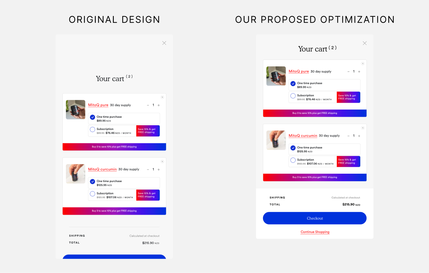
How to implement it: Check your CTA's position on the actual devices your traffic uses, not just your desktop monitor. On mobile, this often means cutting a secondary headline or trimming hero copy so the button fits above the fold without shrinking it. During a CRO audit for MitoQ, our team recommended a sticky checkout button specifically to keep the primary CTA visible above the fold as the cart grew, rather than letting it drift out of view once a visitor added more than one product.
3. Use Directional Cues to Guide the Eye Toward the CTA
What it is: Visual elements, such as a person's gaze in a photo, an arrow, or a line created by spacing, that lead the eye from the headline toward the CTA.
Why it converts: This follows directly from strategy 2. A visible CTA still gets missed if nothing in the layout points toward it. Visual hierarchy is not just about what is biggest, it is about the path the eye takes across the screen.
How to implement it: Audit your hero image for where it draws attention. If a model or product photo faces away from your CTA, the layout is working against itself. Reposition the image or the button so the visual flow ends at the action.
4. Replace the Hero Carousel With a Single, Static Message
What it is: One hero image or graphic tied to one message, instead of an auto-rotating carousel cycling through multiple offers.
Why it converts: This follows from strategy 1. A carousel dilutes the single value proposition you just wrote, because it asks visitors to wait for the message they need. We’ve found that a significant share of ecommerce sites implement homepage carousels poorly, with slides rotating too fast or burying the most relevant message behind others visitors never see.
How to implement it: If you currently run a carousel, check your analytics for click-through rate on slides two and three. In most cases, the drop-off makes the case for a single static message on its own.
5. Add Lightweight, Immediately Visible Social Proof
What it is: A trust signal a visitor can register in under a second: a star rating, a recognizable client logo row, a specific number ("trusted by 400+ ecommerce brands").
Why it converts: Once the value proposition and CTA are clear, the remaining hesitation is trust. This is a smaller, faster version of the testimonial blocks that typically live further down the page. It does not replace deeper proof below the fold, it earns the visitor's willingness to keep reading.
How to implement it: Pick the single strongest proof point you have and place it directly under the CTA or subheadline. Resist the urge to add three types of proof at once. This is the same principle as strategy 4: one clear signal beats several competing ones.
6. Match the Headline to the Traffic Source
What it is: Aligning your above the fold value proposition with the specific ad, email, or search query that brought the visitor to the page, rather than using one generic headline for all traffic.
Why it converts: A visitor who clicked an ad promising a specific offer expects to see that offer confirmed immediately. A mismatch between what they clicked and what they land on creates doubt in the first screen, which is exactly the moment strategy 1 is trying to avoid.
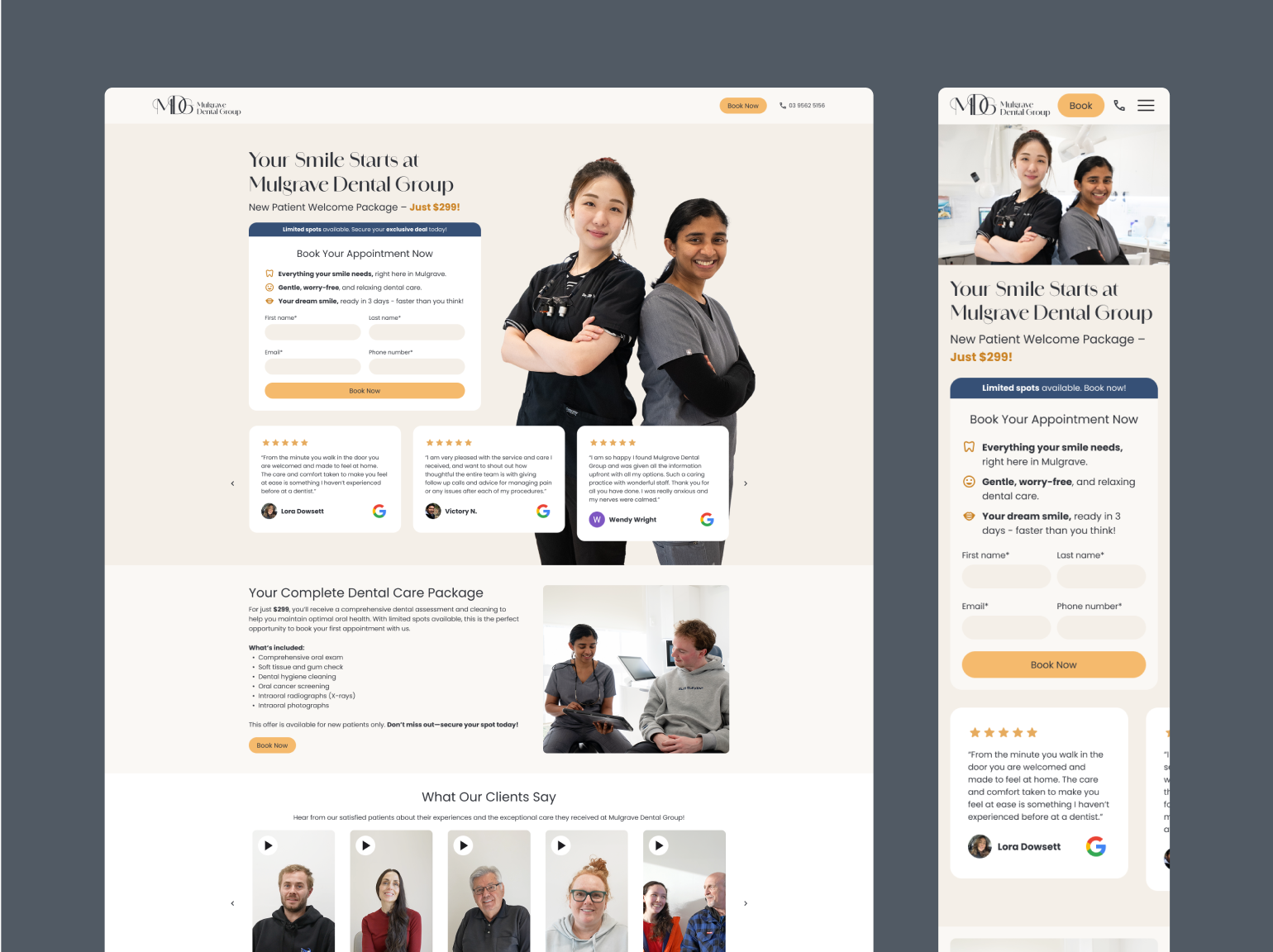
How to implement it: If you run paid campaigns, build landing page variants that mirror the ad copy and imagery for your highest-spend campaigns first, rather than trying to message-match every source at once. When we built a dedicated landing page for Mulgrave Dental Group's billboard campaign, the above-the-fold section carried the same offer, pricing, and visual language as the billboard itself, with the lead form placed above the fold so visitors arriving with intent could act immediately.
7. Treat Hero Section Load Speed as a Design Constraint, Not an Afterthought
What it is: Setting a load speed budget for the hero section specifically, since it is usually the heaviest part of the page (large images, video backgrounds, custom fonts).
Why it converts: This connects directly back to the bounce rate data in the previous section. Google's Core Web Vitals framework flags Largest Contentful Paint above 2.5 seconds as a problem specifically because that metric usually measures how fast the hero section itself renders.
How to implement it: Run your landing page through Google PageSpeed Insights and check the LCP element it reports. If it is a hero image or video, compress it, lazy-load anything below the fold, and avoid auto-playing video as a background unless you have tested its impact on load time.
8. Write a Benefit-Driven Subheadline, Not a Tagline
What it is: A second line under the headline that answers the visitor's next question, typically "how" or "so what," rather than a clever phrase that does not add information.
Why it converts: The headline states the value proposition. The subheadline's job is to remove the next objection, whether that is price, complexity, or fit. Skipping this step wastes the second most valuable line of copy on the page.
How to implement it: Draft the subheadline by finishing the sentence "which means you can..." after your headline. If the result does not add new information, rewrite it.
9. Design the Fold for Mobile First, Not Desktop First
What it is: Building the above the fold layout starting from the smallest common mobile viewport, then adapting up to desktop, rather than the reverse.
Why it converts: For most B2C and B2B sites, mobile traffic makes up the majority of first visits, and mobile screens show far less content above the fold than desktop. A layout designed on a large monitor and shrunk down often pushes the CTA or value proposition out of the initial mobile view entirely, undoing strategies 1 and 2.
How to implement it: Preview every above the fold change on an actual phone before approving it, not just a browser's device emulator. Pay specific attention to whether the CTA is visible without scrolling on a standard mobile viewport.
10. Remove Navigation and Messaging That Compete With the Primary Action
What it is: Trimming secondary links, banners, and promotional messages that share the first screen with your main value proposition and CTA.
Why it converts: This is the final strategy because it protects everything above it. A strong headline, a visible CTA, and a fast-loading hero section still lose to a first screen that also contains a cookie banner, a promotional strip, a chat widget, and a five-item navigation bar all competing for attention at once.
How to implement it: List every element currently visible on your first screen. For each one, ask whether it helps a first-time visitor understand the offer or take the primary action. If it does neither, move it below the fold or remove it.
Above the Fold Optimization Mistakes That Kill Conversions
Most above the fold mistakes come from treating the first screen as a place to say everything, rather than a place to say one thing clearly.
The most common mistake is stacking multiple offers, headlines, or CTAs above the fold because different stakeholders each want their message included. The result is a first screen with no clear hierarchy, which forces the visitor to do the prioritizing work the page should have done for them.
A close second is the auto-rotating carousel, already covered in strategy 4, which is still one of the most frequent findings in ecommerce homepage audits. A majority of mobile sites deliver a mediocre or poor homepage experience, and an oversized, poorly cropped hero image is frequently the cause on smaller screens.
A third mistake is burying the CTA inside the navigation bar or a secondary menu instead of giving it its own visible button. Visitors do not expect to hunt for the primary action, and a text link styled like every other nav item does not read as an action at all. This is the same problem our team flagged during the MitoQ audit referenced above, where a growing cart could quietly push the checkout button out of the visible area unless it was made sticky.
A fourth mistake is ignoring load speed until the design is finished. Teams frequently approve a hero section on a fast office connection, then discover in production that a full-width background video pushes Largest Contentful Paint well past the 2.5-second threshold, quietly undoing every other decision made above the fold.
How to Test Your Above the Fold Section
The only reliable way to know whether an above the fold change actually improves conversions is to test it, rather than assume it based on best practice alone. Every strategy in this guide is a strong starting hypothesis, not a guarantee, because what works depends on your specific audience, traffic source, and offer.
Start with the highest-traffic landing page connected to your most important conversion goal, and test one variable at a time: headline, CTA placement, or hero image, rather than a full redesign all at once. This keeps the result readable, so you know which change actually moved the number. Our A/B and MVT testing work follows this same principle: prioritize tests by traffic volume and potential impact, then let the data decide, not internal opinion.
If your current traffic volume is too low to reach statistical significance quickly, start with qualitative signals instead, such as scroll depth and click maps on the first screen, to identify which strategies from this list are most likely to matter before you commit testing resources to them.
Frequently Asked Questions
What is above the fold in web design? Above the fold is the portion of a webpage visible to a visitor without scrolling, a term borrowed from the upper half of a folded newspaper's front page. On the web, the exact area varies by screen size and device, which is why above the fold optimization has to account for mobile and desktop separately rather than assuming one fixed cutoff.
How long should above the fold content be? Above the fold content should be short enough to fit a headline, subheadline, primary CTA, and one social proof element without crowding, typically no more than two or three lines of copy plus a visible button. Longer content belongs below the fold, where a visitor who is already engaged can read it.
Does above the fold still matter if people scroll anyway? Yes, because what a visitor sees above the fold determines whether they choose to scroll at all. Nielsen Norman Group's research shows attention concentrates heavily in the first visible screen, so a weak or unclear first screen reduces the number of visitors who ever see the content below it, regardless of how good that content is.
What is a good bounce rate for above the fold performance? There is no single universal benchmark, since bounce rate depends heavily on traffic source and industry, but a first screen that loads in under 2.5 seconds and delivers a clear, message-matched value proposition consistently performs better than one that does not, based on the load speed and attention research cited throughout this guide. The more useful benchmark is your own page's bounce rate before and after a specific, tested change.
Above the Fold Optimization Is Ongoing Work, Not a One-Time Project
Above the fold optimization is not something you fix once and leave alone. Traffic sources shift, campaigns change, competitors update their own hero sections, and what converted last year can quietly stop working without anyone noticing until the numbers are reviewed. The teams that keep winning here treat their first screen the way they treat the rest of their conversion rate optimization program: as a system to monitor and test, not a page to launch and forget.
If you want a second set of eyes on your current first screen, from value proposition through load speed, book a free consultation. No obligation, no sales pitch. Just a practical conversation about your website and what's possible.
Book a Free Website Consultation
Discover quick wins for your digital strategy. 100% guaranteed.