Onboarding email journeys are one of the most underestimated conversion levers in digital marketing.
They sit at a critical moment in the customer lifecycle: right after intent is at its highest, but before value is fully realized.
For subscription-based B2C and D2C products, onboarding emails do a few essential jobs at once:
- Help users understand how the product works
- Reinforce why they signed up in the first place
- Reduce early churn by building habits and confidence
- Move users toward the first meaningful outcome
- Support conversion at key moments like free trial expiration
They’re especially important for:
- Products that take time to show results (wellness, education, productivity)
- SaaS tools with a learning curve
- Free trials where success depends on activation before the paywall
Below, we’re pulling insights from real onboarding email competitor benchmarks we’ve done for subscription-based B2C and D2C brands. These examples show how different brands approach onboarding with very different tactics, but similar goals: clarity, motivation, and momentum.
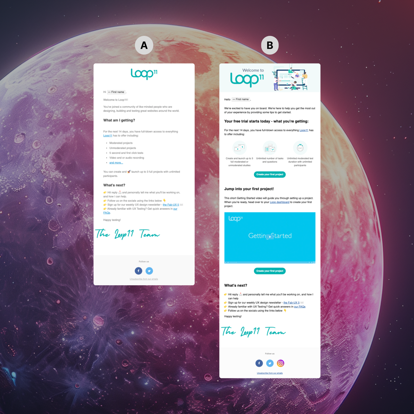
1. Welcome + “How It Works” Emails
Most onboarding journeys start here. The goal isn’t to explain everything, but to reduce uncertainty and set expectations.
Fatty15 – Welcome & Brand Story
Intriguing subject line creates curiosity: “It all started with dolphins 🐬”. The emoji helps it stand out in crowded inboxes.
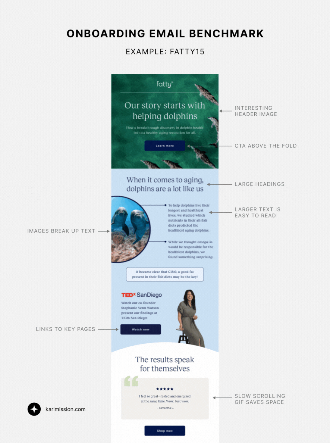
- Visually pleasing header image with a CTA above the fold.
- Larger overall text size improves readability, especially on mobile.
- Short email, but tells the brand story succinctly and links to key site areas.
- Slow-scrolling GIF displays multiple reviews without taking up too much space.
Airtable – Simple & Easy
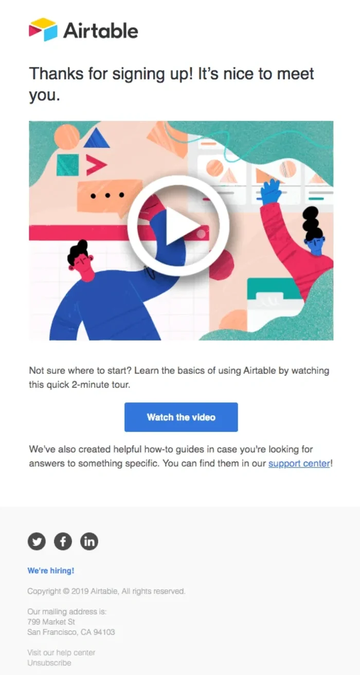
- Keeps it extremely simple by focusing on a single explainer video.
- Low cognitive load, ideal for a product that can otherwise feel complex.
Grammarly – Scannability First
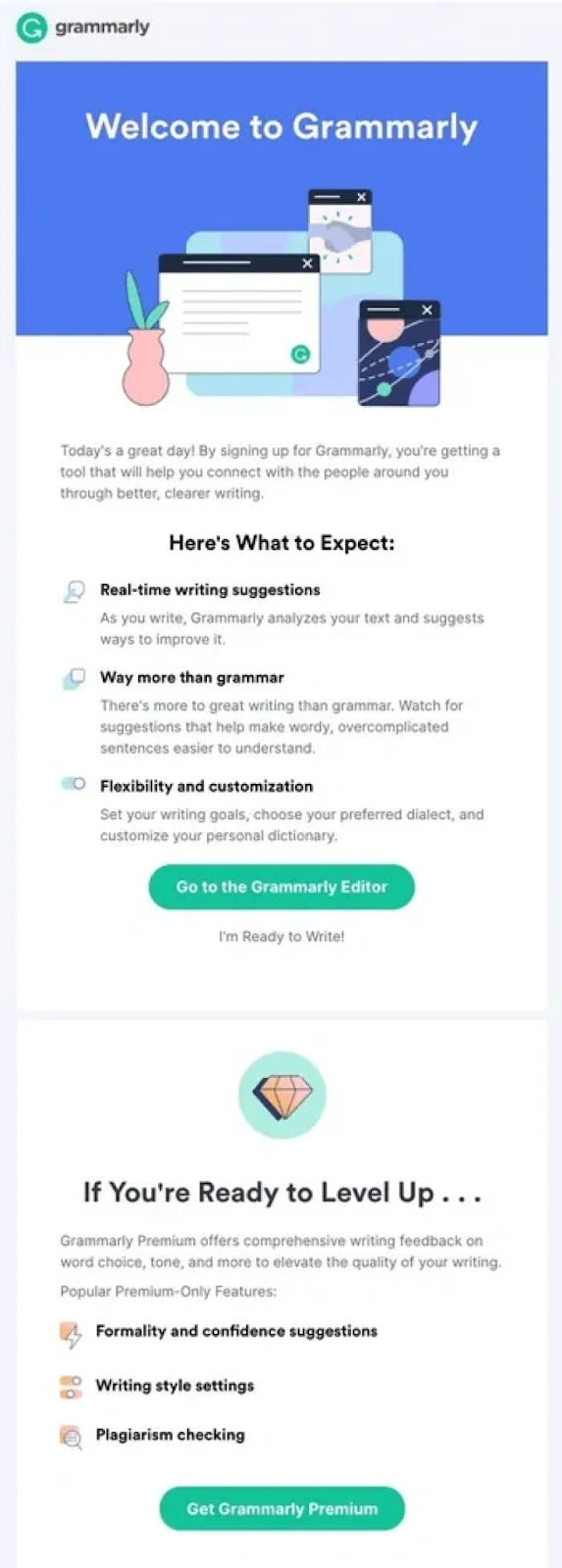
- Clear text hierarchy and icons make content easy to scan.
- Ideal for users who won’t read line-by-line.
reMarkable – Human Touch

- “Thank you” messaging and a personal-style note from the team.
- Reinforces trust and emotional connection early.
CRO takeaway:
A strong welcome email reduces anxiety. The best ones combine clarity, personality, and one clear next step.
2. Benefits-Focused Emails
Once users know what the product is, onboarding should shift to why it matters.
Nike – Benefits Through Community
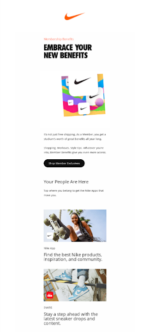
- Title: “Embrace Your New Benefits”
- Messaging like “Your People Are Here” emphasizes belonging.
- Highlights fitness clubs and apps users can join, reinforcing lifestyle value.
Headspace – Simple, Visual Benefits
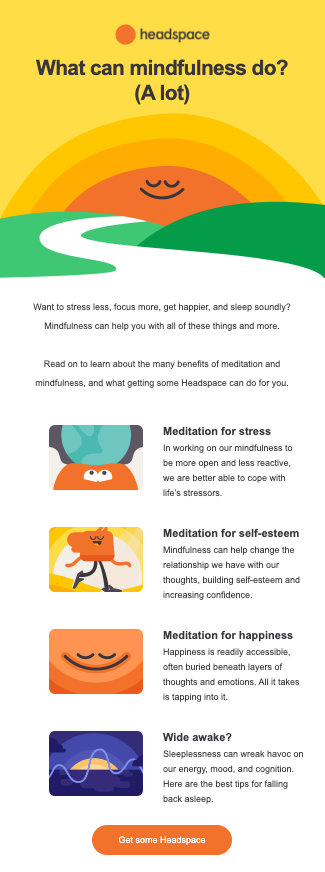
- Benefits are easy to read with short, bold headers.
- Illustrations add warmth and reduce the “clinical” feel of wellness messaging.
CRO takeaway:
Benefits emails work best when they translate features into identity, emotion, or outcomes, not just utility.
3. Science & Credibility Emails
Trust is often the biggest conversion barrier, especially in health, wellness, and education products.
Fatty15 – Science-Led Trust
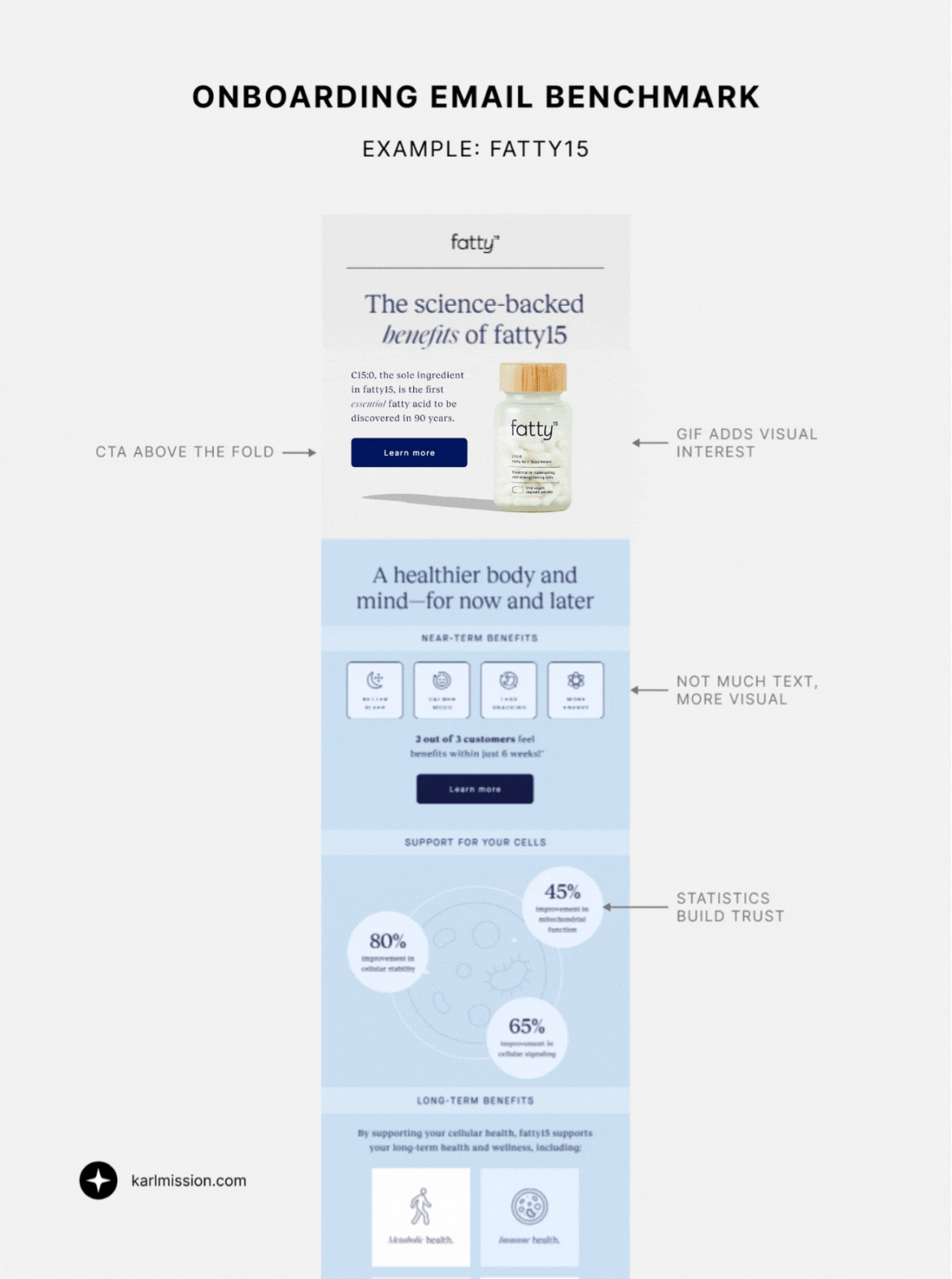
- GIF at the top adds visual interest immediately.
- CTA button near the top links directly to the science page.
- Minimal text, but visuals and strong hierarchy makes it impactful.
- Statistics reinforce credibility.
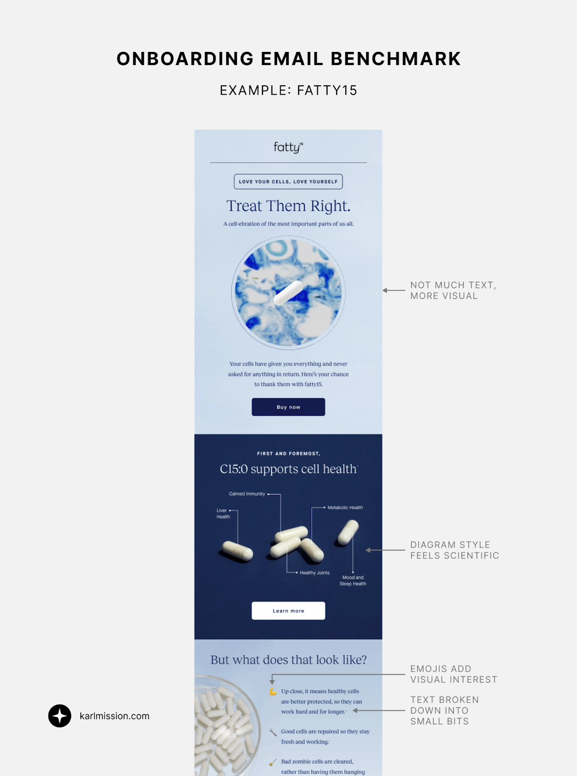
- Diagram-style images explain benefits visually, reinforcing a scientific tone.
- Text broken down into smaller points, making it easier to read and scan.
- Emojis are an easy way to add light visual interest and keep the tone light and friendly.
Headspace – Data Meets Design
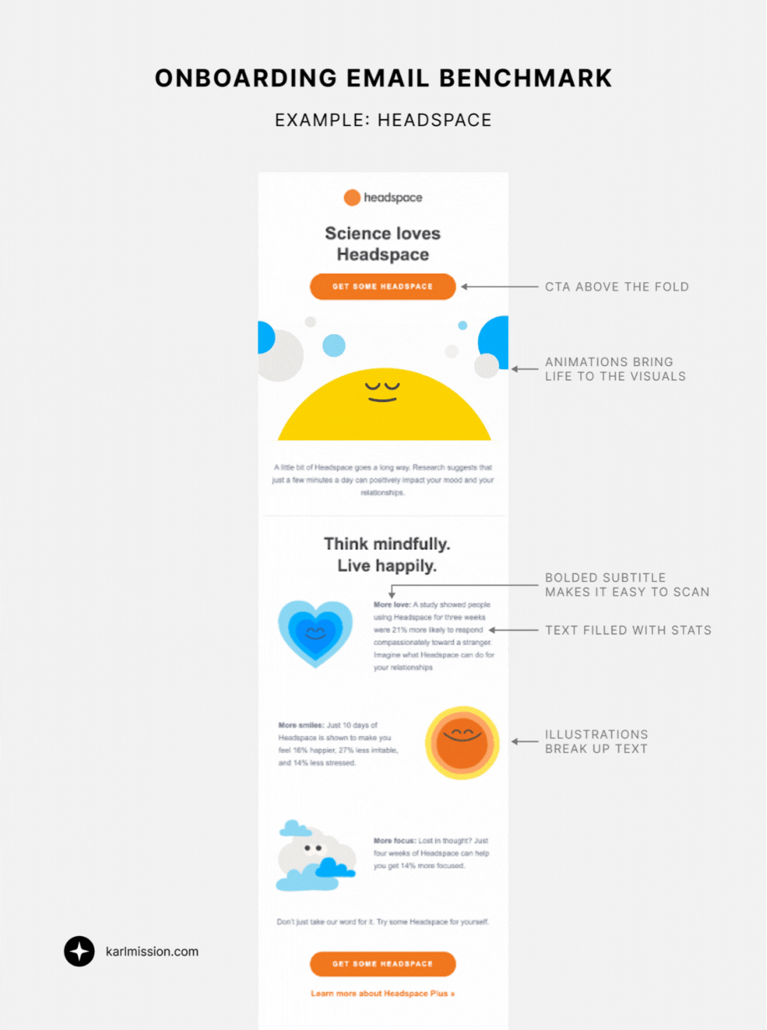
- CTA placed very high in the email.
- Animated illustrations bring warmth to data-heavy content.
- Bold subtitles make scanning easy.
- Heavy use of statistics to build authority.
- Illustrations reinforce branding and pacing.
CRO takeaway:
Credibility emails should feel credible. Strong hierarchy, visuals, and selective data outperform long explanations.
4. Progress Tracking & Momentum Emails
Progress emails are powerful because they shift the focus from the product to the user’s effort and success.
Duolingo – Progress as Motivation
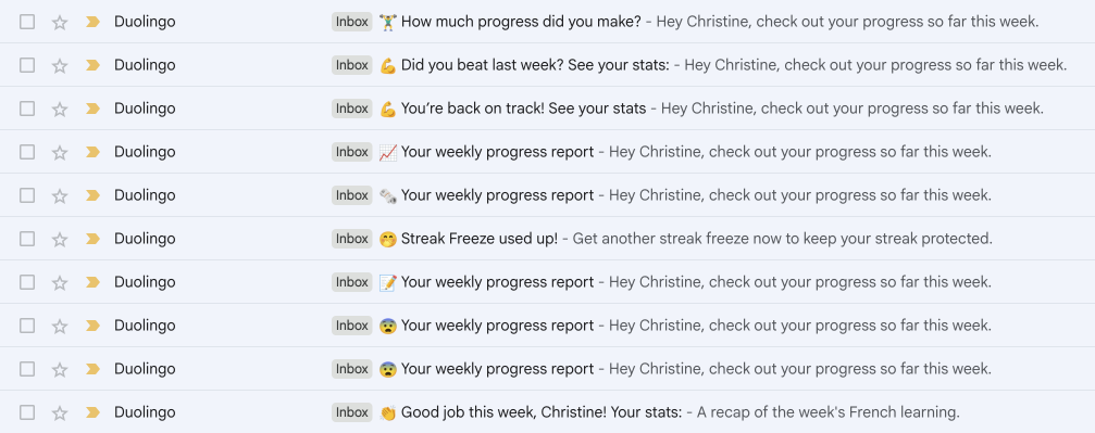
Subject lines include:
- 📝 Your weekly progress report
- 💪 Did you beat last week? See your stats
- 👏 Good job this week, [First Name]!
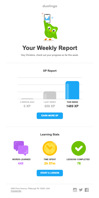
- Graphs and stats clearly visualize progress.
- Competitive framing encourages habit formation.
Upwork – Encouragement First
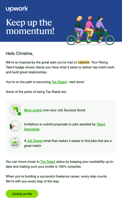
- Title: “Keep up the momentum!”
- Encouraging language paired with reminders of ongoing benefits.
Skillshare – Progress + Incentives
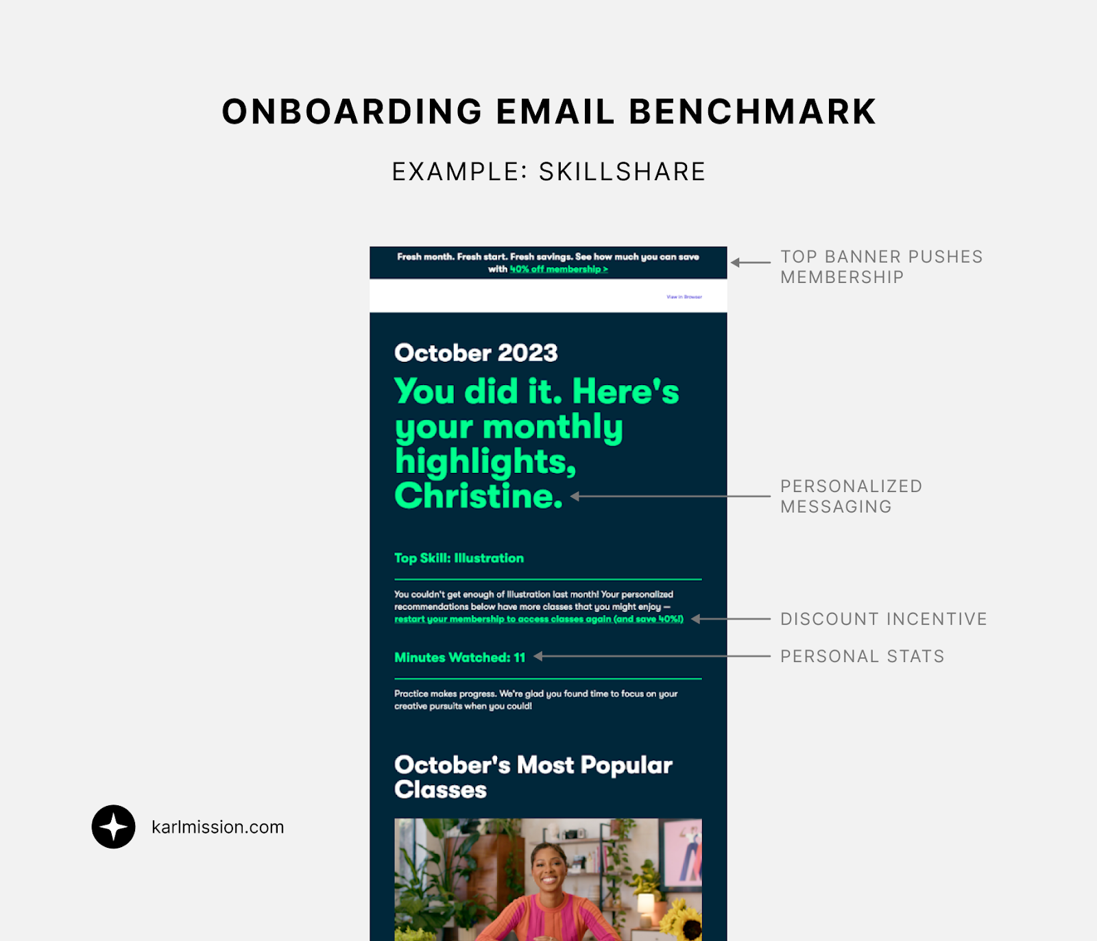
- Top banner nudges membership.
- Personalized encouragement and stats.
- Discount incentive reinforces value.
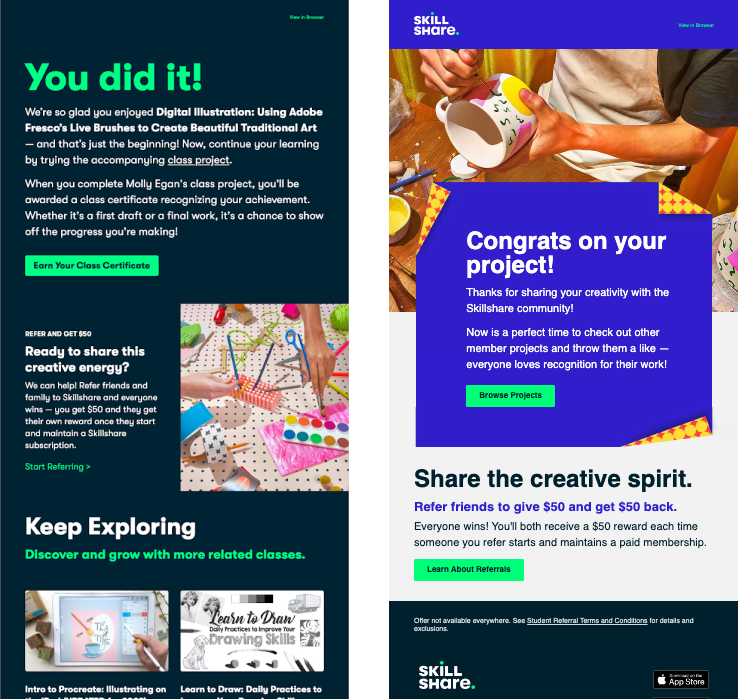
- “You did it!” emails after completing classes push exploration and referrals.
- “Congrats” emails after sharing projects reinforce community and participation.
Care/Of – Visual Progress
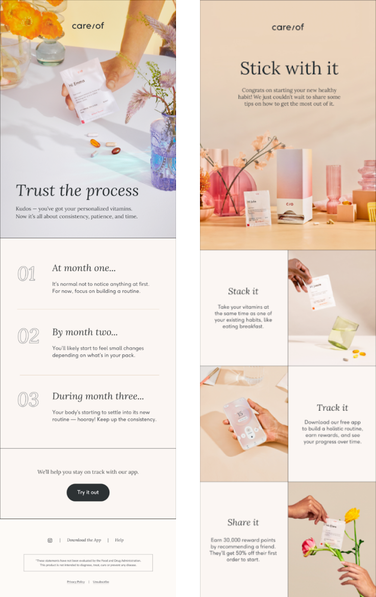
- Soft, aesthetic imagery aligned with target audience.
- Simple timeline clarifies what happens next.
- Follow-up emails reinforce usage, app downloads, and referrals with minimal text.
- Messaging like “Trust the process” and “Stick with it” is encouraging.
YouTube – Milestone Framing
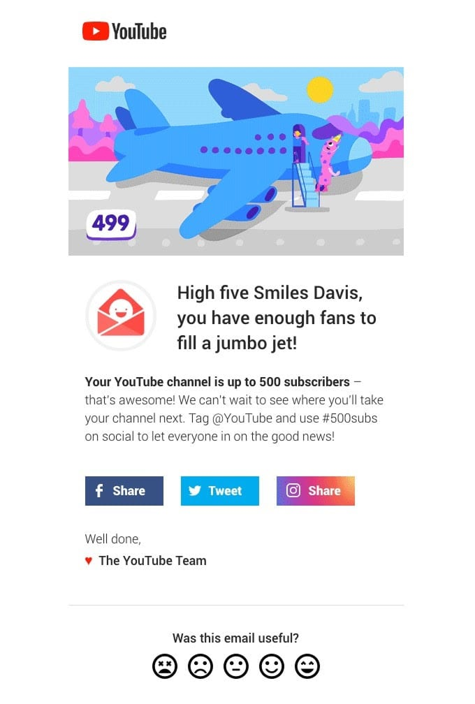
- Congratulates users on milestones.
- Contextualizes achievements with visual metaphors (“you have enough fans to fill a jumbo jet”).
CRO takeaway:
Progress emails work because they reward effort, not just outcomes. They’re key to retention.
5. FAQ-Focused Emails
FAQs reduce friction before it turns into churn.
Fatty15 – FAQs as a Series
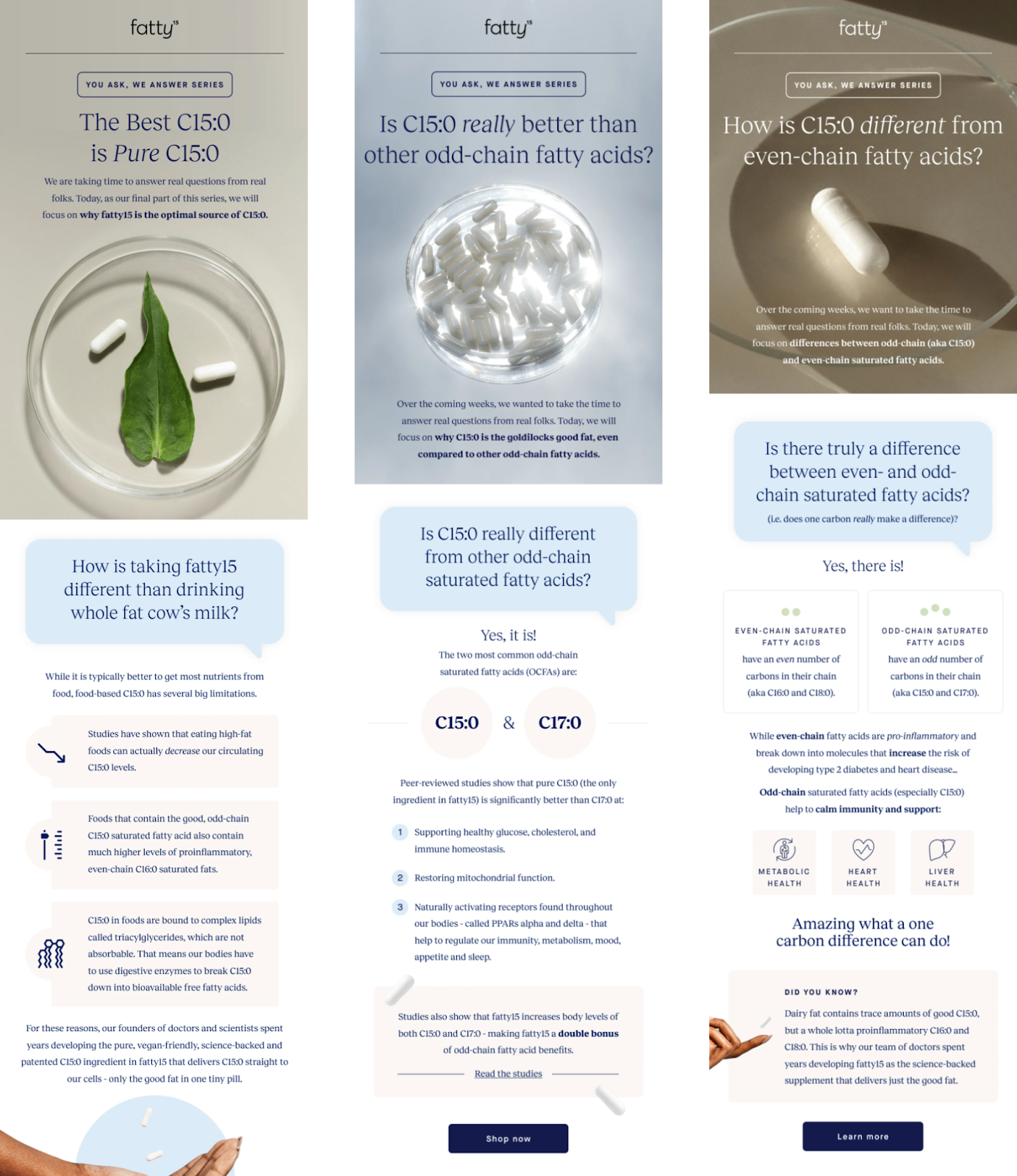
- Fatty15 has an entire email series built around common questions.
- Visual details like speech bubbles make the layout feel intentional.
- Icons, colors, and shapes break content into digestible sections.
CRO takeaway:
FAQs don’t have to feel defensive. When designed well, they feel proactive and reassuring.
6. Subscription Push + Incentives
The transition from free to paid is a critical conversion moment.
Skillshare – Urgency + Discount
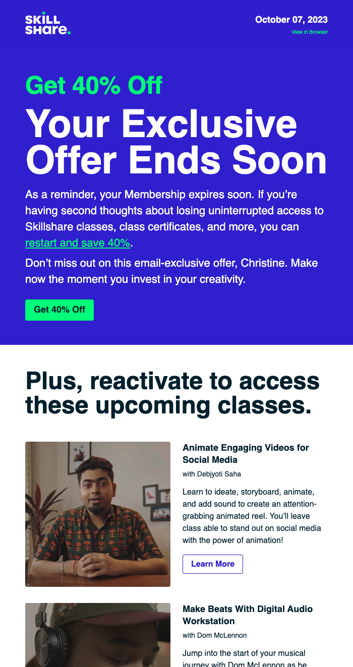
- Email when free trial is about to expire.
- 40% discount incentive.
- Subject line: “Don’t Say Goodbye, [First Name]”
- Title creates urgency: “Your Exclusive Offer Ends Soon”
Squarespace – Clarity First

- CTA button near the top.
- Clear list of benefits with icons.
Headspace – Framing as a Gift
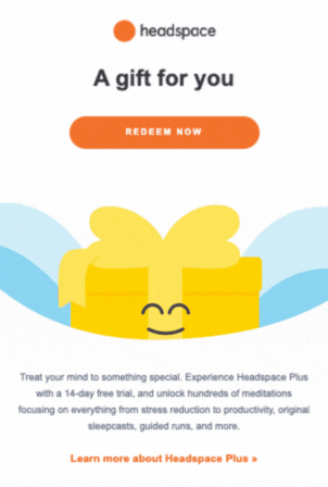
- Positions the trial as a gift.
- Subtle animation adds warmth.
- Frames the product as a “treat yourself” moment.
CRO takeaway:
Subscription pushes work best when urgency is balanced with value and emotional framing.
7. Social Proof Emails
Social proof reduces risk and reinforces confidence.
Fatty15 – Ambassador Stories
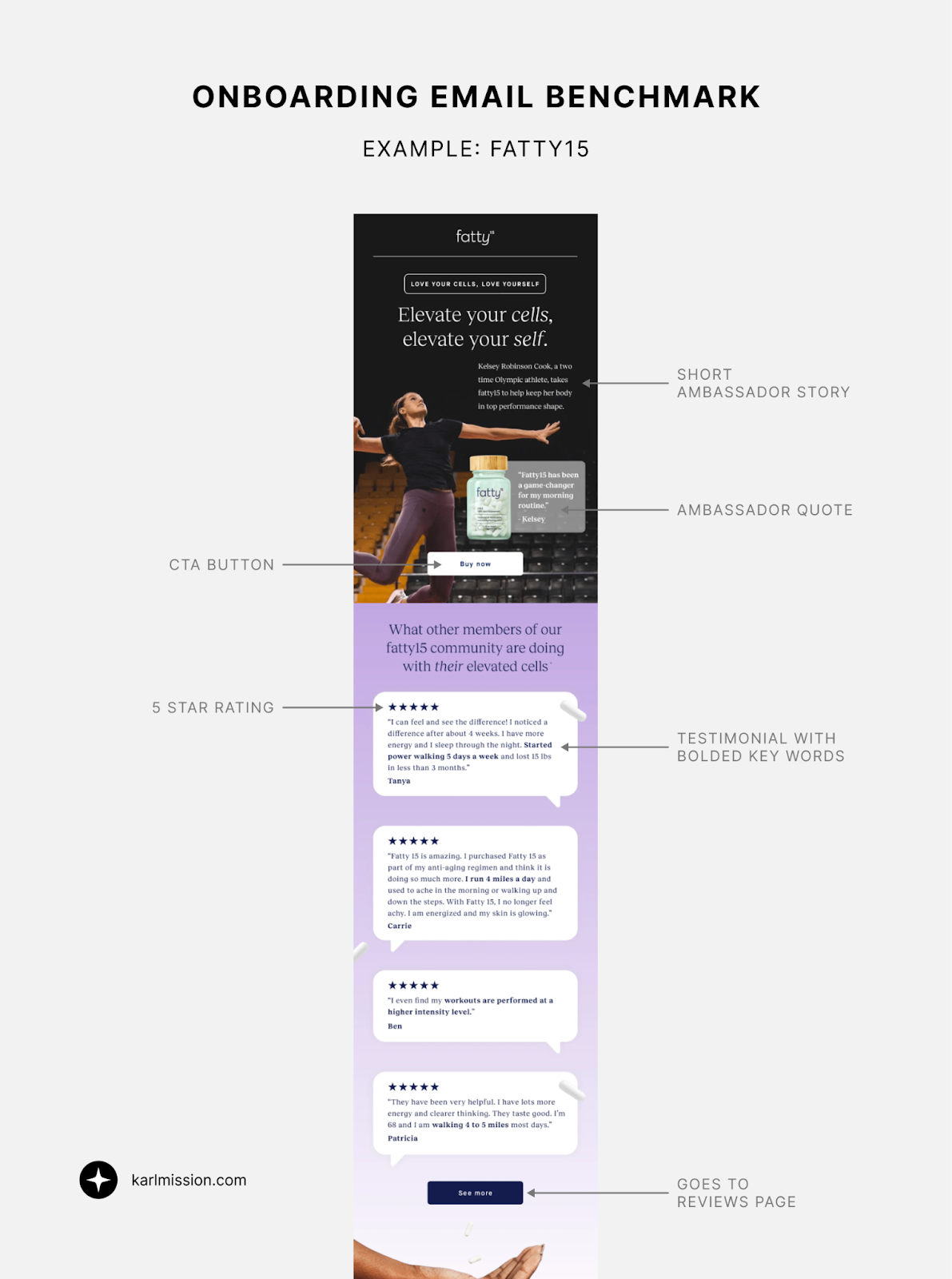
- Starts with a short ambassador story and quote.
- Primary CTA is “Buy now.”
- Bolded keywords highlight key review themes.
- Star ratings reinforce trust.
- Secondary CTA links to the reviews page.
Headspace – Scale as Trust
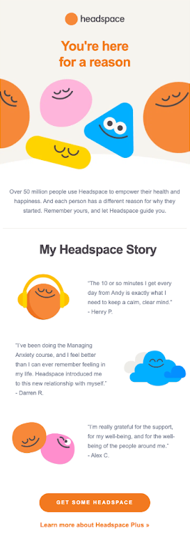
- “50 million people” statistic immediately builds credibility.
- Testimonials used for social proof.
CRO takeaway:
Social proof works best when it’s specific, visual, and tied to a clear CTA.
What High-Performing Onboarding Journeys Have in Common
Across all these benchmarks, the strongest onboarding email journeys:
- Reduce uncertainty early
- Reinforce benefits before asking for commitment
- Use progress and encouragement to build habits
- Address objections proactively
- Time conversion pushes strategically
- Balance clarity, emotion, and trust
If onboarding emails feel like an afterthought, you’re likely leaving conversions on the table.
Want to Improve Your Onboarding Email Performance?
We regularly benchmark onboarding journeys across B2C, D2C, and SaaS brands to identify conversion gaps, missed moments, and quick wins.
If you want help optimizing your onboarding emails, free trials, or lifecycle messaging, book a free consultation. We’ll review your onboarding flow and identify where you can improve activation, retention, and conversion.
Book a Free Website Consultation
Discover quick wins for your digital strategy. 100% guaranteed.