
Most of your traffic is already on mobile. 78% of e-commerce site traffic now comes from mobile phones, yet mobile still converts at roughly half the rate of desktop across most benchmarks, with desktop converting at 3.5% to 4.0% versus mobile's 1.8% to 2.5%.
That gap is not because mobile users are less interested in buying. It is because most websites are still built desktop-first and adapted for mobile as an afterthought. If you fix that gap, even partially, the revenue impact is significant. Closing half the mobile-to-desktop conversion gap can add well over $100,000 a month in revenue for a mid-sized ecommerce store, according to recent CRO benchmark data.
This article breaks down the practical, high-impact mobile optimization strategies we recommend to clients, why they matter, and how to prioritize them if you can't fix everything at once.
Why Mobile Optimization Is a Conversion Problem, Not Just a Design Problem
It's tempting to treat "mobile optimization" as a checkbox: does the site look okay on a phone? But conversion rate optimization for mobile is really about removing friction at every step of a much more constrained user experience. Smaller screens, slower connections (sometimes), thumbs instead of a mouse, and a context where users are more easily distracted all add up to more opportunities for someone to drop off before converting.
A few numbers that make the case:
- Mobile cart abandonment sits at around 80%, compared to 66.4% on desktop.
- A one-second delay in mobile page load time can reduce conversions by up to 20%.
- Only 42% of mobile experiences currently pass all three Core Web Vitals thresholds, compared to 63% on desktop, even though mobile now drives the majority of ecommerce traffic.
In other words, mobile optimization sits at the intersection of UX design, technical performance, and CRO. That's exactly why it deserves a dedicated strategy rather than a "responsive theme" and hoping for the best.
1. Prioritize Page Speed (It's a Conversion Lever, Not Just an SEO Metric)
Page speed is one of the few optimizations that pays off on both the SEO and CRO side simultaneously. Google uses Core Web Vitals as a ranking factor, and users abandon slow pages long before they ever convert.
Practical steps:
- Compress and lazy-load images. Product photos and hero banners are usually the biggest contributors to page weight. Serve responsive image sizes so mobile devices aren't downloading desktop-sized files.
- Minimize third-party scripts. Chat widgets, tracking pixels, and marketing tags add up fast. Audit what's actually adding value versus what's just slowing things down.
- Use a content delivery network (CDN) to reduce latency for visitors far from your server's location.
- Monitor Core Web Vitals (Largest Contentful Paint, Interaction to Next Paint, Cumulative Layout Shift) in Google Search Console and PageSpeed Insights, and treat mobile scores as the priority, not desktop.
Google's own best practice guidance recommends mobile pages load in under three seconds, with servers responding within 1.3 seconds. Every additional second past that point measurably increases bounce and abandonment.
2. Design for Thumbs, Not Cursors
Desktop UX assumes precision. Mobile UX has to assume someone is scrolling one-handed on a moving bus. This changes what "usable" means.
- Make tap targets big enough. Buttons and links should be large enough to tap accurately (Google recommends at least 48x48 pixels) with enough spacing to avoid mis-taps on adjacent elements.
- Keep primary CTAs within thumb reach, typically the lower two-thirds of the screen, rather than burying key actions at the very top where they're harder to reach one-handed.
- Simplify navigation. A hamburger menu with a clear hierarchy usually outperforms a desktop-style mega menu squeezed into a mobile viewport.
- Avoid hover-dependent interactions. Anything that relies on a mouse hover simply doesn't exist on a touchscreen. Make sure important information isn't hidden behind a hover state.
3. Fix Mobile Forms, Because This Is Where Most Conversions Die
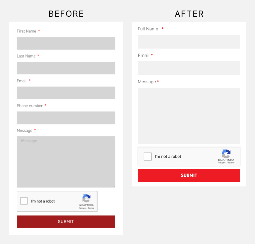
Forms are consistently one of the biggest friction points on mobile, whether it's a checkout, a lead form, or a consultation booking form.
- Reduce the number of fields. Every extra field is an opportunity to lose someone. Only ask for what you truly need at that stage.
- Use the right input types. A numeric keyboard for phone numbers, an email keyboard for email fields, and autofill support for addresses and payment details all reduce typing effort.
- Enable autofill and password managers. Don't fight the browser's built-in tools; work with them.
- Show clear, inline validation. Tell users immediately if a field is wrong, rather than after they hit submit and lose their place.
- Offer guest checkout. Forcing account creation before purchase is still one of the most common causes of mobile cart abandonment.
4. Streamline the Mobile Checkout and Payment Experience
If you run an ecommerce store, checkout is where mobile optimization has the most direct revenue impact. Mobile cart abandonment rates are typically well above desktop, and a large share of that is checkout friction rather than a genuine change of mind.
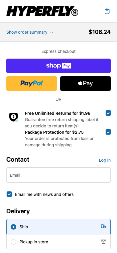
- Add mobile-native payment options like Apple Pay and Google Pay. These can lift mobile conversion by 15% to 30% because they remove manual card entry entirely.
- Show a progress indicator so users know how many steps remain.
- Surface shipping costs and delivery timelines early, not as a surprise at the final step. Hidden extra costs are a factor in 48% of cart abandonment across devices.
- Keep the checkout on a single, focused page (or as few steps as possible) with no distracting navigation.
5. Build Trust Fast, Because Mobile Users Scroll Past It Quickly
On desktop, users have more screen real estate to notice trust signals like reviews, security badges, and guarantees. On mobile, those elements are easy to miss unless you're deliberate about placement.
- Place a short trust signal (review rating, security badge, guarantee) near the primary CTA, not buried at the bottom of the page.
- Use concise social proof, like a star rating and review count, rather than long testimonial blocks that require scrolling.
- Make contact information and support options easy to find. If something feels uncertain, mobile users are quick to bounce rather than hunt for reassurance.
6. Rethink Content Hierarchy for Small Screens
A desktop landing page often relies on side-by-side layouts, large hero sections, and multiple columns. None of that translates directly to mobile. Content needs to be re-prioritized, not just stacked.
- Put the value proposition and primary CTA above the fold on mobile specifically, not just on desktop.
- Break up long paragraphs into shorter blocks, bullet points, and subheadings that are easier to scan on a small screen.
- Use collapsible sections (accordions) for secondary information like FAQs or detailed specs, so the page stays scannable without losing depth.

- Avoid intrusive pop-ups, especially ones that are hard to close on a small screen. Google has penalized sites for mobile interstitials that block content, and users abandon them fast regardless of SEO impact.
7. Test on Real Devices
Browser dev tools are useful for a first pass, but they don't fully replicate real mobile behavior: actual network conditions, real touch interactions, or how a site performs on an older or lower-spec device. If a meaningful share of your traffic comes from older Android devices or slower connections, your emulator testing on the latest iPhone won't tell you the full story.
We recommend combining:
- Real device testing across a mix of iOS and Android devices and OS versions.
- Session recordings and heatmaps specific to mobile traffic, to see exactly where users hesitate, rage-tap, or abandon.
- Mobile-specific A/B and MVT testing, rather than assuming a desktop win will translate directly to mobile. Mobile users often respond differently to layout, copy length, and CTA placement.
8. Treat Mobile-First Indexing as Non-Negotiable for SEO
Google has used mobile-first indexing for years now, meaning it primarily crawls and ranks based on the mobile version of your site, not desktop. If your mobile experience is stripped down, slower, or missing content compared to desktop, it can directly hurt your search rankings, not just your conversion rate.
- Make sure structured data, meta tags, and key content are present on the mobile version, not just desktop.
- Confirm your mobile site isn't blocking any resources (CSS, JS, images) that Google needs to render the page properly.
- Check mobile usability reports in Google Search Console regularly for flagged issues like text too small to read or clickable elements too close together.
Where to Start If You Can't Fix Everything at Once
If mobile optimization feels like a big undertaking, prioritize in this order:
- Page speed - it affects both SEO and every downstream conversion metric.
- Checkout and form friction - this is usually where the most revenue is quietly leaking.
- Mobile-specific UX testing - validate assumptions with real user behavior data instead of guessing.
- Content hierarchy and trust signals - refine once the fundamentals are solid.
Mobile optimization isn't a one-time project. User expectations, device capabilities, and Google's ranking criteria all keep shifting, which is why we treat it as an ongoing part of CRO strategy rather than a redesign checkbox.
Not Sure Where Your Mobile Experience is Losing Conversions?
Our team can run a mobile UX and CRO audit to show you exactly where users are dropping off, and what to fix first. Book a free consultation with KARL Mission to get started.
Book a Free Website Consultation
Discover quick wins for your digital strategy. 100% guaranteed.