Most people don't consciously notice typography when they visit a website. But they absolutely notice when it's wrong.
Hard-to-read text, clashing font combinations, inconsistent sizing: all of these things create friction. And friction kills conversions.
Typography is one of the most underestimated tools in UI design. Done well, it makes your interface feel clear, credible, and easy to use. Done poorly, it sends users away before they've even read a headline.
This guide breaks down everything you need to know about choosing and pairing fonts in UI design, covering readability, visual hierarchy, font categories, and practical rules you can apply to any website or app.
Why Typography Matters More Than You Think
Before we get into the how, let's talk about the why.
Typography accounts for around 95% of web design, according to web design educator Oliver Reichenstein. That's not an exaggeration. Almost everything on a webpage is text. Headlines, body copy, button labels, navigation menus, error messages, form fields. All of it is typography.
When your typography is working, users glide through your interface without thinking about it. They read, they understand, they take action. When it's not working, they slow down, squint, feel confused, and leave.
Here's what poor typography actually costs you:
- Lower readability leads to shorter time on page, which signals to search engines that your content isn't valuable
- Poor visual hierarchy means users don't know where to look first, so they don't take the action you want
- Mismatched fonts undermine your brand credibility, making you look less trustworthy
- Bad mobile typography frustrates users who are increasingly browsing on smaller screens
Good typography, on the other hand, builds trust, guides users through your content, and ultimately supports conversions. It's a UX tool and a conversion rate optimization (CRO) tool at the same time.
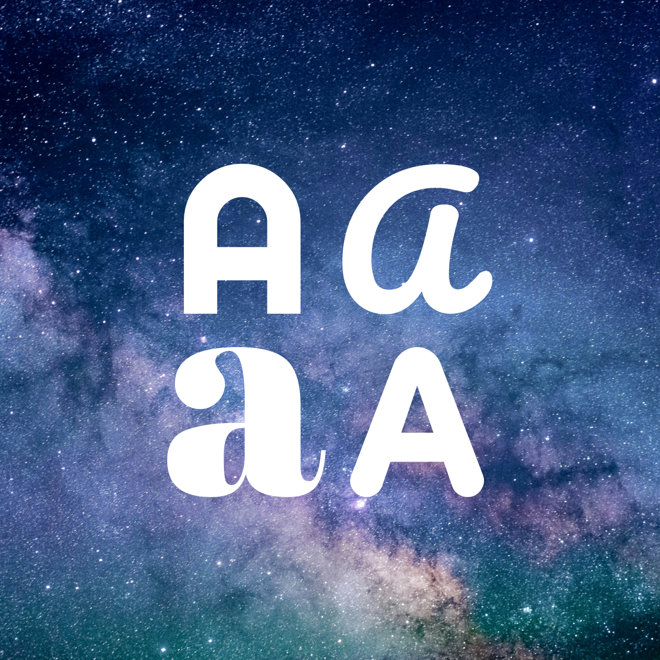
Understanding Font Categories First
To make smart font choices, you need to understand what you're working with. Fonts fall into a few major categories, and each has its own personality and best use case.

Serif Fonts
Serif fonts have small decorative strokes (called serifs) at the ends of letterforms. Think Times New Roman, Georgia, Garamond, or Playfair Display.
Serifs have a traditional, established feel. They're associated with authority, heritage, and credibility. In print, serifs are often preferred for body text because the strokes help guide the eye across a line. On screens at smaller sizes, serifs can sometimes feel harder to read, though modern serifs designed specifically for screens handle this well.
Good for: Law firms, financial services, luxury brands, editorial content, premium products

Sans-Serif Fonts
Sans-serif fonts (literally "without serifs") have clean, minimal letterforms. Think Helvetica, Futura, Lato, or Nunito.
Sans-serifs feel modern, clean, and approachable. They're highly readable on screens, especially at smaller sizes, which is why they dominate web and app interfaces.
Good for: Tech companies, SaaS products, health and wellness brands, startups, e-commerce

Display and Decorative Fonts
These are expressive, stylized fonts built for large sizes. Think impact headlines, script fonts, or heavily stylized letterforms.
Display fonts are not meant for body text. At small sizes they become unreadable, and overused they look amateurish. But used sparingly at large sizes, a great display font can instantly communicate personality and make a brand feel distinctive.
Good for: Hero headlines, brand wordmarks, campaigns, and landing pages. Not suitable for body copy.

Monospace Fonts
Every character in a monospace font takes up the same width. Think Courier, Roboto Mono, or IBM Plex Mono.
These fonts signal code, technology, and precision. Outside of developer tools or code snippets, they're rarely used in mainstream UI design.
Good for: Developer tools, fintech, technical documentation, code examples
The Principles of Good UI Typography
Now let's get into the core principles that should guide every typography decision you make in UI design.
1. Prioritize Readability Above Everything Else
This sounds obvious but gets violated constantly. A font might look beautiful in a specimen or on a design inspiration site, but the real test is whether your actual users can read it comfortably in your actual interface.
Several factors affect readability:

Letter spacing (tracking): The space between characters. Too tight and text feels cramped. Too loose and words become hard to read as units. For body text, slight adjustments to default tracking are usually all you need. Avoid applying very wide tracking to lowercase text, as it hurts readability.

Line height (leading): The space between lines of text. For body copy, a line height of around 1.4 to 1.6 times the font size is generally comfortable. Text with too little line height feels claustrophobic. Too much and your eye struggles to find the next line.

Line length (measure): The number of characters per line. The sweet spot for comfortable reading is between 50 and 75 characters per line. Lines that are too long cause eye fatigue. Too short and reading becomes choppy and disjointed.
Contrast: Your text needs to be legible against its background. The Web Content Accessibility Guidelines (WCAG) recommend a contrast ratio of at least 4.5:1 for normal text. Low-contrast text is a common accessibility failure that also frustrates users without any visual impairments.
Font size: For body text in web UI, 16px is considered the standard minimum. Many designers go to 17 or 18px for better readability. Never go below 14px for any body copy, and be especially careful on mobile.
2. Build a Clear Visual Hierarchy
Visual hierarchy is how you guide users' eyes through a page. Typography is your primary tool for creating it.
Every page should have a clear typographic hierarchy with distinct levels:
H1 (Page headline): The most prominent text on the page. One per page. This is what users read first and should communicate the core value or purpose immediately.
H2 (Section headings): Major section breaks. Noticeably smaller than H1 but still clearly larger than body text.
H3 (Subsection headings): Used to organize content within sections.
Body text: Your primary reading text. Comfortable, readable, and not competing with headings for attention.
Supporting text: Captions, labels, metadata, fine print. Smaller than body text, typically in a secondary color or reduced opacity.
CTAs and UI labels: Button text, navigation labels, form labels. These often need distinct treatment to signal interactivity.
The key is that each level looks distinctly different from the others. If your H2 and H3 are hard to distinguish, your hierarchy isn't working. Use a combination of size, weight, spacing, and sometimes color to create clear differentiation.
A good rule of thumb: use a typographic scale. Common ratios include 1.25 (Major Third) or 1.333 (Perfect Fourth). This gives you a mathematically harmonious progression of sizes that naturally feels balanced.

3. Limit Your Font Choices
One of the most common typography mistakes, especially among non-designers, is using too many fonts. More than two or three typefaces on a single interface creates visual noise and looks unprofessional.
The standard approach in UI design is to use two fonts:
- One for headings (can be more expressive or distinctive)
- One for body text (should prioritize readability)
Sometimes you can get away with using a single font family by leveraging different weights and styles. A versatile font like Inter, Neue Haas Grotesk, or Source Sans 3 can work beautifully across all levels of hierarchy just by varying weight (Light, Regular, Medium, Bold, Black) and size.
The danger zone is three or more distinct typefaces. Unless you have a very clear, intentional reason and strong design expertise, it almost always looks cluttered.
4. Consider Your Brand Personality
Typography communicates personality before users read a single word. The shape, weight, and texture of your fonts say something about who you are.
Some general associations to keep in mind:

Geometric sans-serifs (Futura, Montserrat) feel modern, precise, and confident

Humanist sans-serifs (Gill Sans, Myriad) feel friendly, approachable, and human

Old-style serifs (Garamond, Caslon) feel classic, trustworthy, and editorial

Transitional serifs (Times New Roman, Georgia) feel authoritative and established

Slab serifs (Rockwell, Clarendon) feel bold, sturdy, and direct

Script fonts feel personal, elegant, or handcrafted, but are hard to read at scale
Make sure your font choices align with your brand values and your audience's expectations. A playful script font is a poor choice for a cybersecurity company. A stern geometric serif is a poor choice for a children's education app.
How to Pair Fonts: Practical Rules That Work
Font pairing is part science, part intuition. Here are the approaches that consistently work in UI design.
Pair Contrast, Not Conflict
The best font pairs create contrast: they look clearly different from each other without conflicting or competing. A common mistake is pairing two fonts that are similar but not identical. They look like an accident rather than a choice.
Effective contrast strategies:
- Pair a serif heading font with a sans-serif body font (a classic combination that works in almost any context)
- Pair a bold, expressive display font with a neutral, readable body font
- Pair a high-contrast typeface (thick and thin strokes) with a low-contrast, even-weight font
Use the Same Type Family
One of the safest and most reliable approaches is to stay within a single type family that offers multiple stylistic variants. Many modern font families include both serif and sans-serif versions, and these are designed to complement each other and almost always look great together.
Examples of families with complementary variants:
- IBM Plex (Plex Serif + Plex Sans)
- Source (Source Serif + Source Sans)
- Roboto (Roboto + Roboto Slab)
- Merriweather (Merriweather + Merriweather Sans)

Pair Similar Moods, Different Textures
Fonts that share a similar emotional quality but have different visual textures work well together. A refined, editorial serif and a clean humanist sans-serif can share a sense of sophistication while looking visually distinct.
Avoid pairing fonts with conflicting personalities. A whimsical hand-drawn script alongside a cold, geometric sans-serif will feel incoherent.
Use Weight and Size as Your Pairing Tools
Sometimes the best "pair" is the same font in different weights. A bold or black weight for headings and a regular or light weight for body text can look incredibly clean and professional. The consistency creates cohesion; the weight contrast creates hierarchy.
This approach works especially well for product interfaces, dashboards, and apps where simplicity and clarity are priorities.
Test Your Pairs in Context
Fonts look different in design tools than they do in browsers. They look different at various sizes, on different devices, and in different color contexts. Always test your font pairs with actual content in an actual interface before committing.
Look for:
- Does the pairing feel harmonious or jarring?
- Is the heading font still readable at large sizes on mobile?
- Does the body font feel comfortable to read at paragraph length?
- Do both fonts render well across browsers and operating systems?
Web Fonts vs. System Fonts: What to Use
When building for the web, you have a choice between web fonts and system fonts.
Web fonts (served via Google Fonts, Adobe Fonts, or self-hosted) give you access to thousands of typefaces and allow for more distinctive, brand-specific typography. The tradeoff is a small performance cost, as fonts need to be downloaded before they display, which can cause a flash of unstyled text if not handled properly.
System fonts (fonts that come pre-installed on users' devices, such as San Francisco on Apple and Segoe UI on Windows) load instantly because they're already on the user's device. They're a great choice when performance is a priority, though they offer less typographic distinctiveness.
For most marketing websites and landing pages, web fonts are the right call the visual control and brand consistency are worth the minor performance tradeoff (especially if you optimize font loading correctly). For complex web apps where performance is critical, system fonts or a minimal web font stack is often the smarter choice.
Typography and Accessibility
Accessible typography isn't just an ethical responsibility, it's good for business. Roughly 1 in 12 men and 1 in 200 women have some form of color vision deficiency. Around 2.2 billion people globally have some form of visual impairment.
Key accessibility considerations for UI typography:
Color contrast: As mentioned, aim for WCAG AA compliance at minimum (4.5:1 contrast ratio for normal text, 3:1 for large text). Use tools like the WebAIM Contrast Checker to verify.
Don't rely on color alone: If you're using color to convey meaning (e.g., red for errors), always pair it with another visual indicator like an icon or label.
Avoid justified text: Full justification creates irregular word spacing that makes reading difficult, especially for users with dyslexia.
Use real text, not text in images: Text in images can't be resized by the user and isn't readable by screen readers.
Allow text scaling: Don't use fixed pixel sizes that prevent browser text scaling. Use relative units (em, rem) instead of hard pixel values for font sizes.
Be cautious with all-caps: Capital letters are harder to read than mixed case. Use sparingly, and never for long stretches of body text.
Common Typography Mistakes in UI Design
Here's a list of the most frequent typography errors we see on websites and what to do instead.
Using too many fonts. Stick to two, maximum three typefaces. When in doubt, use one family with varied weights.
Setting body text too small. Anything below 16px for body copy will hurt readability on most screens. Go bigger, not smaller.
Ignoring line height. Default line heights are often too tight for comfortable reading. Set your body text line height to at least 1.4.
Low contrast text. Light gray text on a white background looks elegant in design comps and is genuinely painful to read in practice. Test your contrast ratios.
Inconsistent typographic hierarchy. If users can't tell at a glance what's a heading and what's body text, your hierarchy needs work. Create a clear typographic system and stick to it.
Using decorative fonts for body text. Script fonts, display fonts, and novelty typefaces are not body text fonts. Ever.
Forgetting mobile. Always check your typography on actual mobile devices. Font sizes, line lengths, and spacing all behave differently on small screens.
Centered body text. Centering is fine for short headlines and CTAs. Long paragraphs of centered body text are very hard to read. Use left-aligned text for any paragraph-length content.
Recommended Font Pairings to Get You Started
Here are some tried-and-tested font pairings that work well in UI design across different brand styles.

Clean and Modern (SaaS, Tech)
- Headings: Inter Bold or Semibold
- Body: Inter Regular (Single family, weight contrast only clean, professional, highly readable)

Editorial and Credible (Finance, Consulting, Legal)
- Headings: Playfair Display
- Body: Source Sans 3

Friendly and Approachable (Health, Education, Nonprofits)
- Headings: Nunito Bold
- Body: Open Sans

Bold and Direct (E-commerce, Consumer Brands)
- Headings: Barlow Condensed ExtraBold
- Body: Barlow Regular

Premium and Refined (Luxury, Fashion, Hospitality)
- Headings: Cormorant Garamond
- Body: Lato Light or Regular
These are starting points, not rules. The right pair for your brand depends on your audience, your personality, and the context of your interface.
Frequently Asked Questions About Typography in UI Design
How many fonts should I use on a website?
Two is the standard recommendation one for headings and one for body text. You can often get away with just one font family by using different weights. More than three fonts almost always creates visual clutter.
What's the best font size for body text in web design?
16px is the widely accepted minimum. Many UX designers now recommend 17 or 18px for improved readability, particularly for text-heavy content. On mobile, 15 to 16px is the minimum.
What's the difference between a typeface and a font?
A typeface is the family (e.g., Helvetica). A font is a specific instance within that family (e.g., Helvetica Bold 14pt). In everyday conversation, the terms are used interchangeably but in design, the distinction matters.
Can I mix serif and sans-serif fonts?
Absolutely. Mixing a serif heading with a sans-serif body (or vice versa) is one of the most reliable font pairing strategies in web design. The contrast between the two styles naturally creates visual hierarchy.
How do I know if my font contrast is accessible?
Use a free tool like WebAIM's Contrast Checker (webaim.org/resources/contrastchecker/). Input your text color and background color and it will tell you whether you pass WCAG AA or AAA standards.
Should I use Google Fonts?
Google Fonts is a great, free resource for web fonts with a huge variety of quality options. The main consideration is performance. Make sure to load only the weights you actually need, and use font-display: swap to prevent layout shifts during loading.
Does typography affect SEO?
Not directly, but indirectly yes. Good typography improves readability, which increases time on page and reduces bounce rate. These are signals Google pays attention to. Accessible, readable text also helps with structured data and screen reader compatibility, which supports overall SEO health.
Is Your Website's Typography Working For You?
Typography might seem like a design detail, but it has a real impact on how users experience your site and whether they convert. If your website feels hard to navigate, lacks clarity, or just doesn't feel quite right, the issue might be simpler than you think.
Our team offers a free consultation where we'll take a look at your site and identify the UX and design factors affecting your results. No obligation, just honest, practical feedback from people who do this every day.
Book a Free Website Consultation
Discover quick wins for your digital strategy. 100% guaranteed.