When it comes to SaaS websites, the navigation bar is often the first major touchpoint where potential customers explore what a platform can do for them. With products that span multiple features, integrations, and use cases, SaaS brands rely heavily on mega menus to communicate value quickly and guide users to the right destination.
Unlike eCommerce, where mega menus are typically about showcasing product categories and promotions, SaaS mega menus serve a more strategic role: they must simplify complexity, highlight innovation (especially trendy features like AI), and funnel prospects into solutions that match their team size, industry, or business objectives.
To uncover what works, we studied some SaaS platforms - Zendesk, Hotjar, Loop11, Webflow, Asana, and others like Glassbox and Monday. Below, we break down how these companies structure their mega menus, what they’re doing right, and the trends that every SaaS brand should pay attention to.
What Is a SaaS Mega Menu?
A SaaS mega menu is an expanded dropdown navigation menu that organizes a product’s wide range of capabilities, solutions, and resources in a clear, scannable way. It’s where visitors often get their first impression of how intuitive (or overwhelming) a platform might be.
For SaaS companies, mega menus serve three critical purposes:
- Product education: Summarizing complex features and showing what makes the platform powerful.
- Audience targeting: Tailoring solutions by team, company size, or industry to match search intent and improve SEO.
- Conversion nudges: Highlighting CTAs for free trials, demos, or AI features that differentiate the brand.
A well-designed mega menu reduces friction and actively supports the sales funnel.
SaaS Competitor Benchmarks
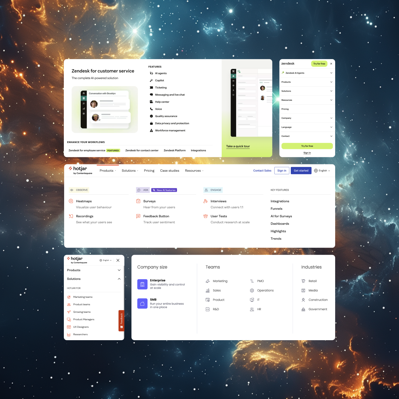
Zendesk
Zendesk takes a visually rich approach.
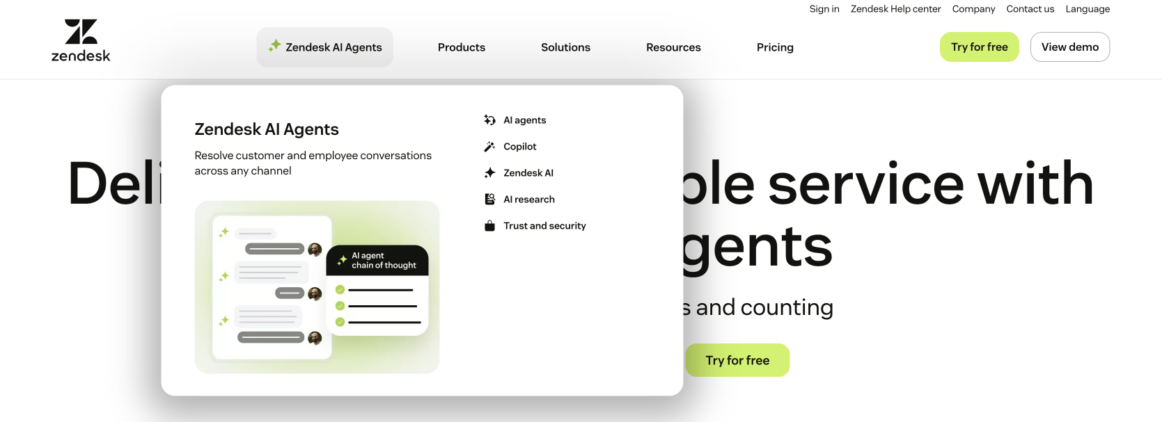
Visual emphasis: Uses a sparkle icon in a bright chartreuse to spotlight its AI Agents feature, paired with imagery in the submenu.

Product breakdown: “Products” submenu lists core features alongside a “Take a quick tour” featured link with supporting visuals.
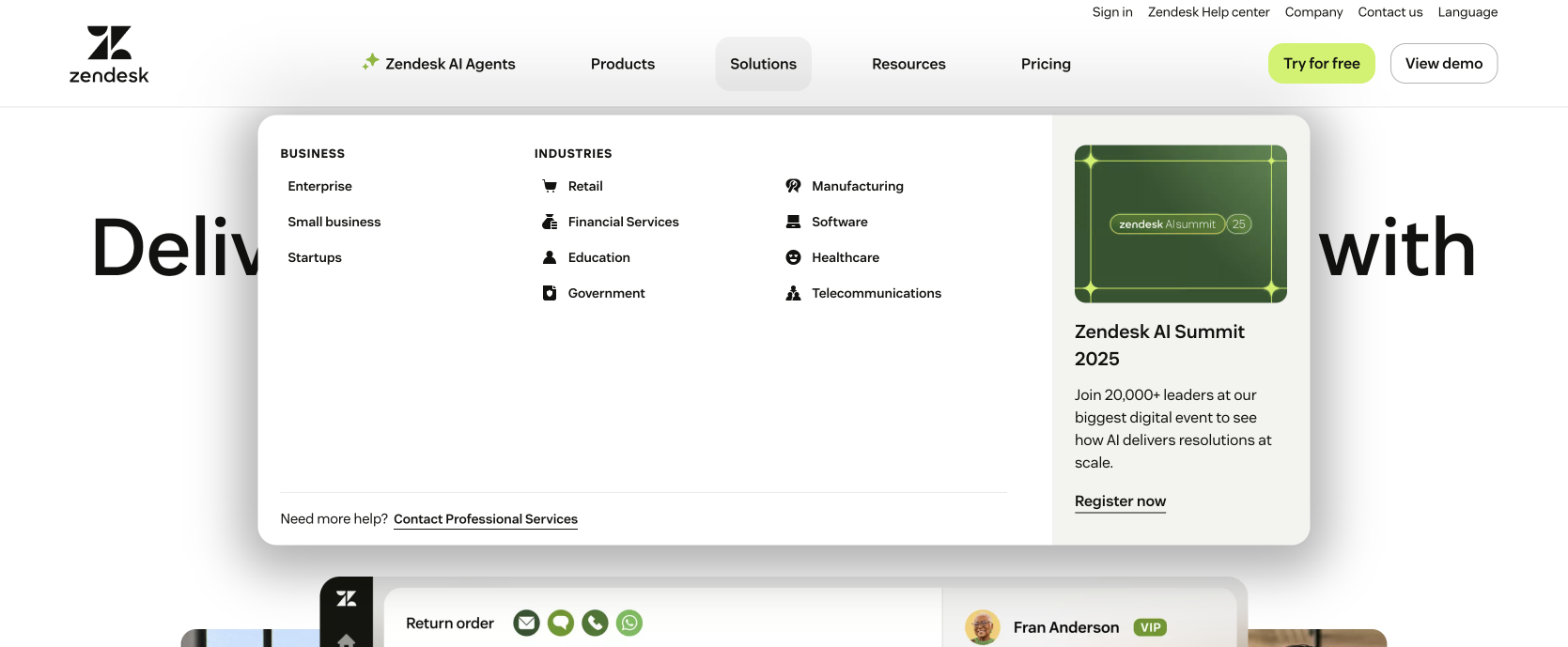
Solutions strategy: Links are divided by business size (enterprise, SMBs, startups) and by industry verticals. This dual structure supports SEO by capturing a wide range of intent-driven queries.
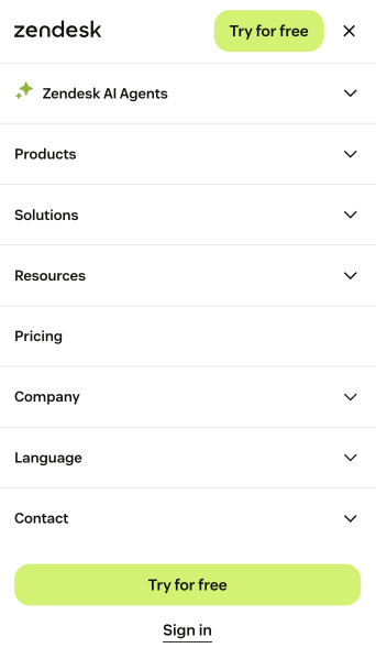
Mobile CTA design: The sticky nav bar hosts a small CTA button, complemented by a larger, bold CTA bottom at the bottom of the mobile menu.
Key takeaway: Zendesk shows how SaaS mega menus can combine SEO-driven structure with visual storytelling and strategic CTA placement for a cohesive experience.
Hotjar
Hotjar organizes its menus by business objectives, which makes discovery intuitive.
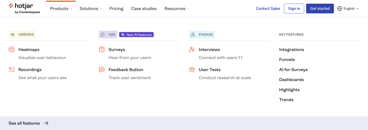
Action-based categories: Products are grouped under “Observe,” “Ask,” and “Engage,” reflecting how users think about goals rather than technical features.
AI highlights: “Ask” has a “New AI features” bubble to draw attention.
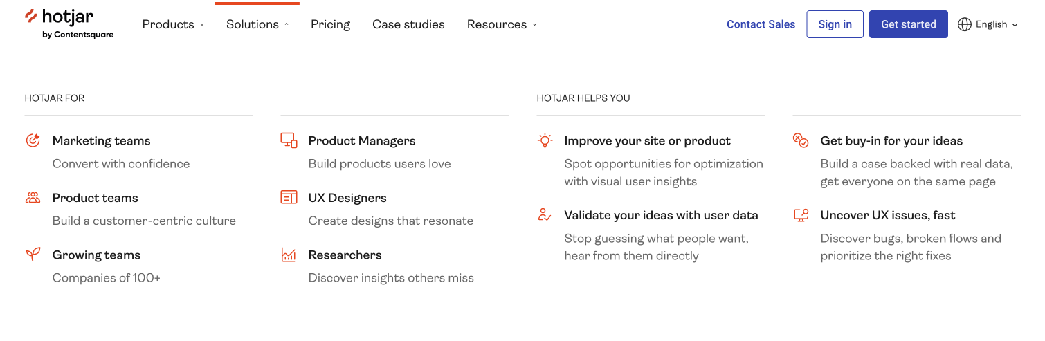
Solutions clarity: Links are divided by team type (marketers, product teams, UX designers, researchers) which captures varied use cases and improves keyword relevance.
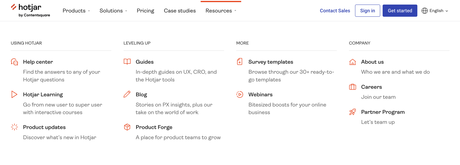
Resources depth: The resources submenu is meticulously structured:
- Using Hotjar (help center, tutorial videos, product updates)
- Leveling up (guides, blogs)
- More (templates, webinars)
- Company (about, careers, partners)
Key takeaway: Hotjar demonstrates how task-based organization paired with robust resources navigation makes complex products easier to digest.
Loop11
Loop11 uses a feature-first strategy.
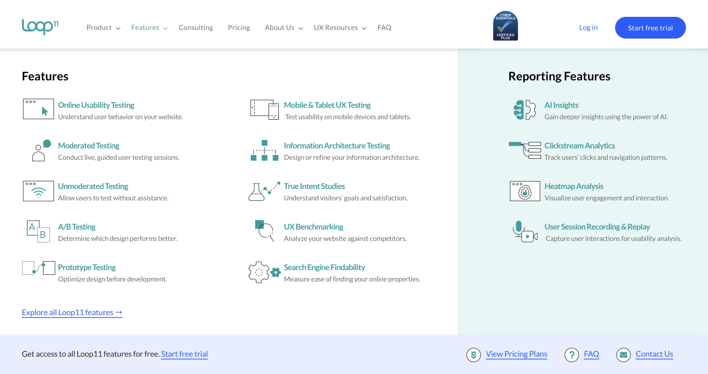
Detailed features list: Each feature is paired with an icon and a short description, giving immediate clarity.
Right-hand reporting section: Segments reporting features as a standalone category, highlighting depth.
Conversion links: At the bottom, users can find direct links to free trials, pricing, FAQs, and contact information, lowering friction for action-taking.
Key takeaway: Loop11 proves that clarity trumps clutter when menus lead with concise explanations and follow up with easy access to conversion CTAs.
Webflow
Webflow’s mega menu is highly structured, reflecting its complex platform.
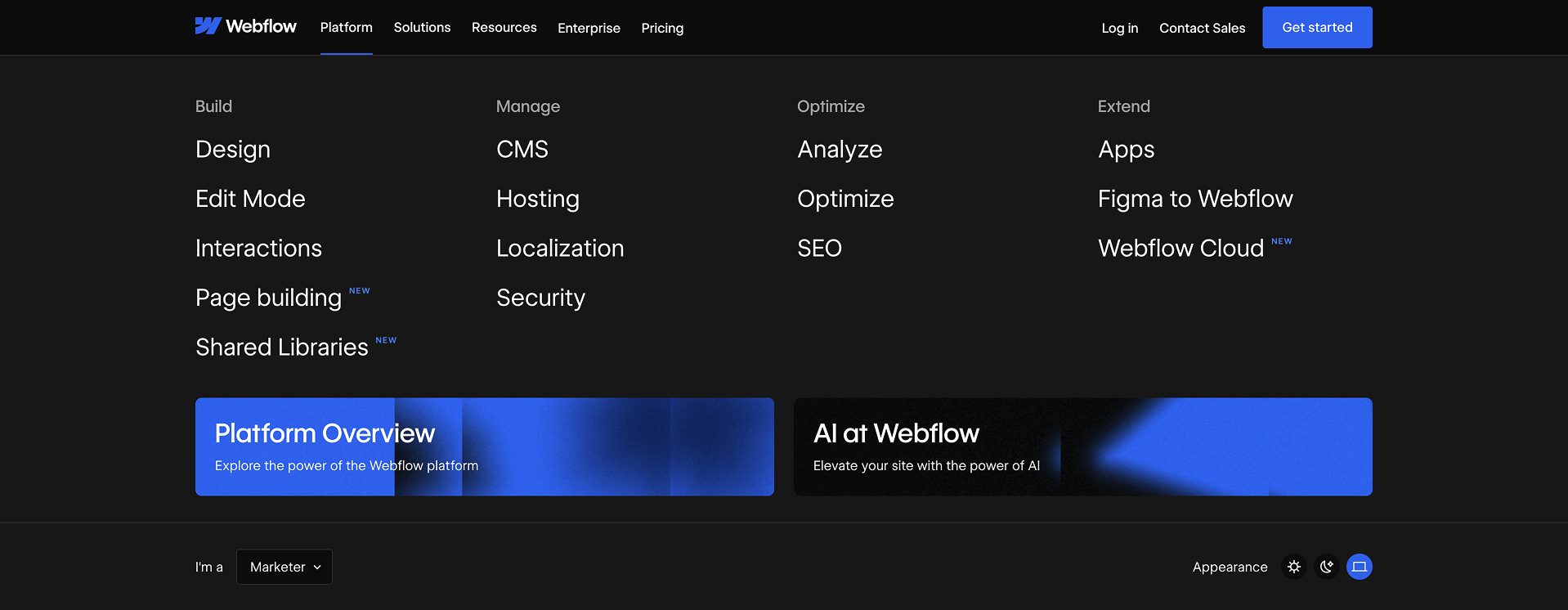
Categorized by product lifecycle:
- Build: Design, interactions, editing tools
- Manage: CMS, hosting, localization, security
- Optimize: Analytics, optimization, SEO
- Extend: Apps, integrations, Figma to Webflow, Webflow Cloud
New feature labeling: Subtle blue “New” tags highlight updates.
Prominent feature links: Bottom links promote “Platform Overview” and “AI at Webflow.”
Key takeaway: Webflow excels at logical grouping by workflow, helping users orient themselves even in a vast ecosystem.
Asana
Asana balances clarity and breadth in its mega menus.
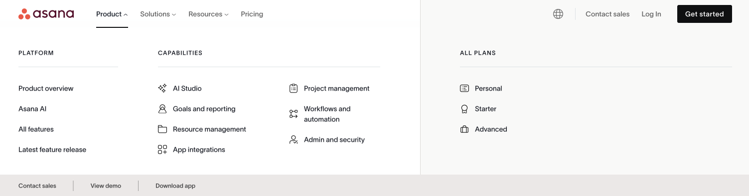
Product categorization: Links split into Platform, Capabilities, and Plans.
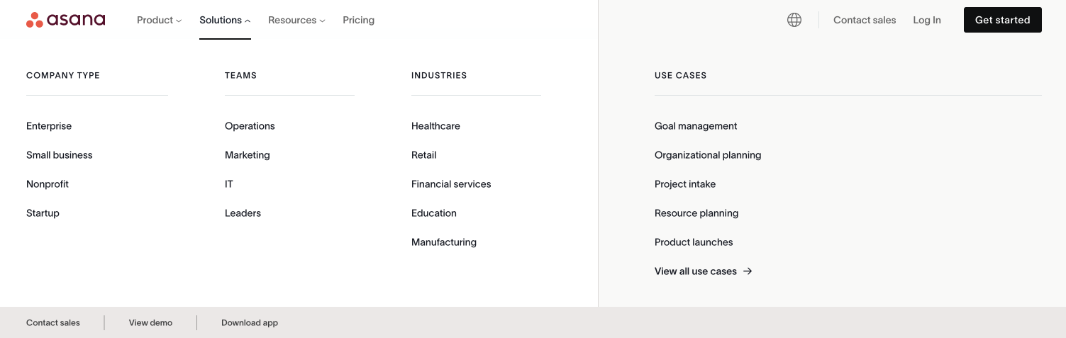
Solutions segmentation: Organized by company type, teams, industries, and specific use cases.
Feature support: Menus consistently reinforce Asana’s core features, ensuring repeated exposure.
Key takeaway: Asana shows the value of multi-dimensional categorization, letting users explore by platform scope, business need, or industry relevance.
More Examples: Glassbox and Monday

Both Glassbox and Monday reinforce the trends above: AI highlights, solutions organized by team and industry, and accessible links to product tours or pricing.
Key takeaway: Consistency across the SaaS landscape suggests these patterns are becoming table stakes rather than differentiators.
Emerging Trends in SaaS Mega Menus
From analyzing these platforms, a few clear trends are shaping SaaS mega menus in 2025:
- AI is front and center
Every major SaaS brand is spotlighting its AI features by using icons, “New” labels, or bold color treatments. - SEO-driven solution menus
Grouping links by industry, company size, or team type not only helps users but also improves keyword targeting. - Icons and visuals enhance scannability
Icons, photos, and micro-labels provide visual anchors in dense menus. - Mobile-first design
SaaS brands are investing in dual CTA strategies (sticky nav + bottom CTA) and simplified collapsible menus for smaller screens. - Conversion pathways built-in
Pricing, free trial, and demo links are consistently integrated into the menu to reduce steps toward conversion.
Best Practices for SaaS Mega Menus
Based on competitor analysis, here’s a checklist for designing an effective SaaS mega menu:
- Lead with value, not jargon: Organize features around outcomes (e.g., “Engage Customers”) instead of technical terms.
- Highlight innovation: Use labels or icons to draw attention to new or differentiating features.
- Segment solutions smartly: Offer pathways for industries, company sizes, and team roles.
- Balance visuals with readability: Icons and photos help, but avoid overloading menus with too many graphics.
- Keep conversion close: Include links to pricing, free trial, and demos within one click.
- Design mobile-first: CTAs should adapt for small screens, ensuring users can act without scrolling endlessly.
- Support SEO goals: Ensure solution menus and resource hubs are keyword-rich and logically structured.
Common Pitfalls to Avoid
Even top SaaS brands can slip up. Here are frequent mistakes to avoid:
- Overcrowding with features: Dense menus overwhelm; prioritize hierarchy.
- Neglecting mobile: Desktop menus don’t always translate well so make sure to optimize for tap and swipe.
- Burying CTAs: If trial/demo links aren’t visible, you risk losing high-intent visitors.
- Inconsistent labeling: Mixing jargon with plain language confuses users.
Final Thoughts
SaaS mega menus are about navigation, storytelling, conversion, and differentiation in a crowded marketplace. By studying competitors like Zendesk, Hotjar, Loop11, Webflow, and Asana, one thing is clear: the best mega menus go beyond being functional. They actively demonstrate product value, highlight innovation like AI, and guide users seamlessly toward the next step.
If your SaaS menu is outdated or underperforming, it might be time to rethink your structure. A thoughtful redesign can improve navigation and even unlock conversions.
Looking to optimize your SaaS website navigation?
At KARL Mission, we specialize in creating user experiences that drive measurable results. Book a free consultation to see how we can help.
Book a Free Website Consultation
Discover quick wins for your digital strategy. 100% guaranteed.