Every so often we get asked what tools we use day-to-day. So we thought: why not just open our bookmarks and share them?
This isn't a sponsored list, and it's not a roundup of "the 50 best tools in 2025." It's just a handful of free tools we actually use regularly across CRO, UX design, accessibility, SEO, email marketing, and web analytics. Some of them are simple. Some are more niche. All of them earn their spot.
Let's get into it.
Accessibility and Color
1. WhoCanUse

What it is: A color contrast checker that shows you how a foreground and background color combination is experienced by people with different types of visual impairments.
What we use it for: Accessibility compliance is a big part of UX and UI design work, and color contrast is one of the most common areas where sites fall short. WhoCanUse is great because it doesn't just give you a pass/fail against WCAG 2.1. It actually simulates how the color combination looks to someone with protanopia, deuteranopia, cataracts, and other conditions. That contextual view is genuinely useful when you're trying to make design decisions that go beyond checkbox compliance.
Useful for: UI designers, UX designers, developers, anyone doing accessibility audits.
Frequently asked question: What is WCAG color contrast compliance? WCAG (Web Content Accessibility Guidelines) sets minimum contrast ratios between text and background colors to ensure readability for users with visual impairments. The standard AA level requires a ratio of at least 4.5:1 for normal text.
2. Contrast Tools
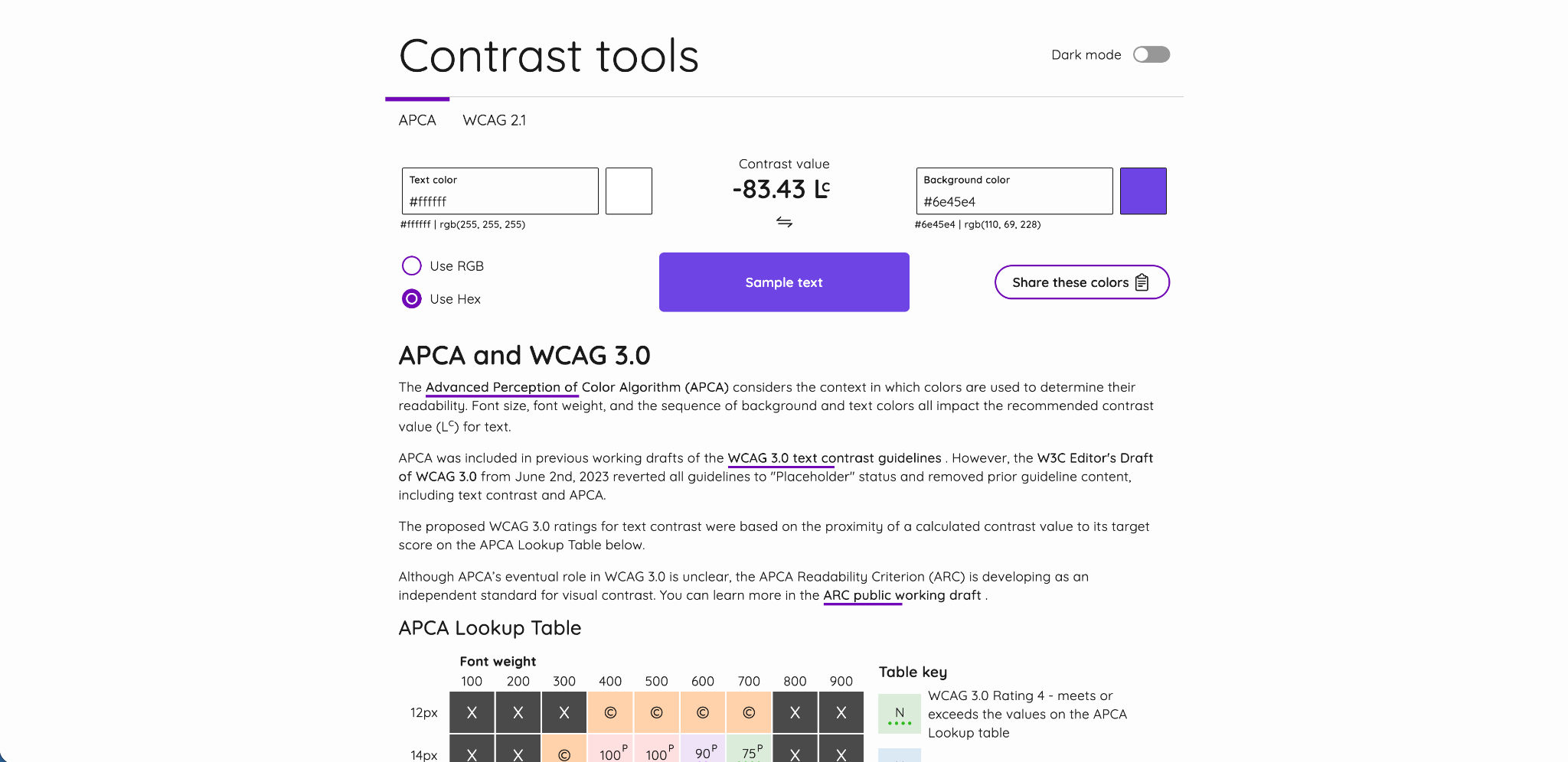
What it is: A more advanced color contrast checker that supports both WCAG 2.1 and the newer APCA (Advanced Perceptual Contrast Algorithm) standard.
What we use it for: When accessibility requirements go beyond basic WCAG 2.1 compliance, particularly for projects where APCA is relevant or where you want a more nuanced view of contrast, this tool is excellent. APCA is considered a more accurate model of how humans actually perceive contrast, especially for larger text, decorative elements, and non-text contrast scenarios. We use it alongside WhoCanUse depending on the project requirements.
Useful for: UI designers, developers, accessibility specialists.
Frequently asked question: What is APCA contrast? APCA stands for Advanced Perceptual Contrast Algorithm. It's a newer contrast measurement model being developed for WCAG 3.0 that accounts for font weight, size, and polarity (light-on-dark vs dark-on-light) to give a more accurate picture of readability than the current WCAG 2.1 ratio method.
3. Accessible Color Palette Generator by Venngage
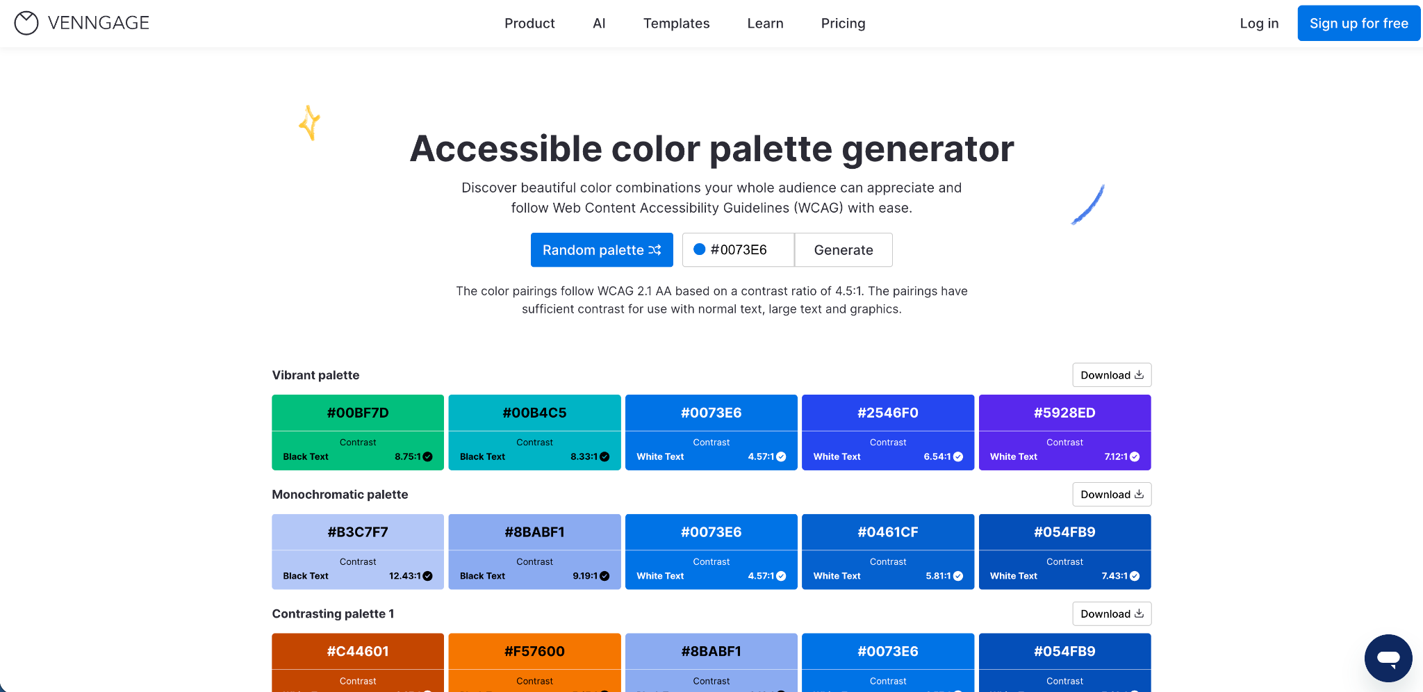
What it is: A color palette generator that builds color combinations with sufficient contrast ratios built in from the start.
What we use it for: Early-stage brand and UI design work. You input a color, often a brand primary color, and it generates a full palette of combinations that already meet WCAG contrast requirements. This is a huge time saver compared to manually testing every color pairing. It's especially useful when working with clients who have an existing brand color but need a full UI color system built around it.
Useful for: UI designers, brand designers, UX designers, anyone building accessible design systems.
Frequently asked question: How do you create an accessible color palette? Start with your primary brand color, then use a tool like this to generate supporting colors that all meet minimum contrast requirements. That way accessibility is built into the palette from the start, not bolted on at the end.
UI and Design
4. Typescale

What it is: A visual typography scale generator based on classic musical and mathematical ratios.
What we use it for: Getting type sizes right is one of those things that separates a polished design from one that just feels slightly off. Typescale lets you pick a base font size, choose a scale ratio (like Major Third, Perfect Fourth, or Golden Ratio), and instantly see a full typographic hierarchy. This is especially useful at the start of a design system or a new web project, when you need to lock in your heading sizes before anything else. It removes the guesswork and gives you sizes that naturally look harmonious together.
Useful for: UI designers, web designers, anyone building a design system or style guide.
Frequently asked question: What is a typographic scale? A typographic scale is a set of font sizes that follow a consistent mathematical ratio, so headings and body text feel visually balanced and intentional rather than arbitrary.
5. Streamline

What it is: A large library of icons and illustrations available in multiple styles, with both free and paid options.
What we use it for: UI design and web design projects where you need consistent, high-quality icons across a range of styles, from minimal line icons to filled, hand-drawn, or 3D styles. The free tier gives you access to a solid selection, and the paid options are worth it for larger projects. Having consistent iconography is one of those things that quietly elevates a design, and Streamline makes it easy to find the right style for any project.
Useful for: UI designers, web designers, anyone building or refreshing a website or app.
Frequently asked question: What icon format is best for websites? SVG is almost always the best choice for web icons. They scale to any size without losing quality, are lightweight, and can be styled with CSS.
SEO and Page Performance
6. Word Counter

What it is: A free, no-frills word and character counting tool.
What we use it for: More than you might expect. On the surface it's just a word counter, but it also shows estimated reading time, which is genuinely useful when writing blog posts and trying to hit a length that balances SEO depth with readability. We also use it to check meta title and description character lengths before publishing, since getting those right matters for SEO click-through rates. And occasionally we'll paste in a line of body copy or a heading to check character count when designing a page and working within a specific line length.
It sounds basic, but it's one of the tools we open multiple times a week.
Useful for: Content writers, SEO specialists, UX copywriters, anyone managing on-page SEO.
Frequently asked question: How long should a blog post be for SEO? There's no single answer, but most well-ranking posts tend to sit between 1,500 and 2,500 words for competitive topics. Word Counter helps you track that as you write.
7. FreeConvert PNG to WebP

What it is: A free online file converter for turning PNG images into WebP format.
What we use it for: Page speed optimization. WebP files are significantly smaller than PNGs without a noticeable loss in quality, which directly improves Core Web Vitals scores, specifically Largest Contentful Paint (LCP). If a client's site is loading slowly and images are the culprit, converting them to WebP is one of the fastest wins available. FreeConvert handles bulk uploads and doesn't require you to install anything.
Useful for: Web developers, SEO specialists, anyone working on page speed or Core Web Vitals improvements.
Frequently asked question: Does image format affect SEO? Yes. Google uses page speed as a ranking factor, and large image files are one of the most common causes of slow load times. WebP images typically reduce file size by 25 to 35 percent compared to PNG, which can meaningfully improve your scores.
Marketing Research and Analytics
8. Milled

What it is: A searchable archive of email marketing campaigns from brands across the world.
What we use it for: Competitor and industry research for email marketing. If we want to understand how a brand structures their welcome sequence, what subject lines a competitor is testing, or how an industry typically approaches promotional emails, Milled is the first place we go. You can search by brand, topic, or keyword and filter by date. It's like a free swipe file for email marketers.
Useful for: Email marketers, content strategists, anyone planning an email marketing program or looking to improve open rates and email design.
Frequently asked question: How do you research competitor email marketing? Subscribing to competitor lists is one approach, but it's slow. Milled lets you browse and search sent campaigns without signing up for anything, which makes competitive research much faster.
9. GA4 Dimensions and Metrics Cheat Sheet

What it is: A searchable reference guide for every dimension and metric available in Google Analytics 4, including the exact API names you need for custom reports and explorations.
What we use it for: If you work with GA4 regularly, you know how frustrating it can be to remember the exact field name for a dimension or metric when building a custom report or writing a Looker Studio formula. This cheat sheet puts everything in one searchable place. It's not glamorous, but it saves time every single time.
Useful for: Web analysts, digital marketers, anyone managing GA4 reporting or building custom dashboards.
Frequently asked question: What is the difference between dimensions and metrics in GA4? Dimensions are descriptive attributes (like page title or traffic source), while metrics are quantitative measurements (like sessions or conversion rate). Understanding the difference is essential for building meaningful reports.
Wrapping Up
None of these tools are complicated, and that's kind of the point. The best tools in a day-to-day workflow are the ones you can open, use in 30 seconds, and close again. These are the ones that have stayed in our bookmarks because they actually earn their place.
If any of these relate to areas you're trying to improve on your own site, whether that's accessibility, page speed, email marketing, or analytics, feel free to reach out. We're always happy to talk through what might make the most impact for your specific situation.
Ready to Improve Your Website's Performance?
If you're looking to improve your conversion rates, accessibility, page speed, or marketing effectiveness, our team can help you identify the quick wins and longer-term opportunities.
Book a free consultation. No obligation, no sales pitch. Just a practical conversation about your website and what's possible.
Book a Free Website Consultation
Discover quick wins for your digital strategy. 100% guaranteed.