When it comes to ecommerce, few industries are as competitive as apparel. Brands like Adidas and Nike have perfected the art of guiding users from product discovery to purchase through intentional product page design. Every element from the size guide placement to the way discounts are displayed contributes to one key metric: conversion rate.
At KARL Mission, we help brands bridge the gap between clicks and conversions. In this article, we’ll break down key UX and CRO insights from Nike and Adidas’ product listing and product detail pages, highlighting what works and how you can apply these best practices to your own ecommerce site.
1. Product Listing Pages: Capturing Attention and Driving Clicks
Before users even land on a product page, they’re browsing a product listing page (PLP) and that’s where many conversion opportunities are either made or lost. Adidas and Nike both use subtle yet effective design cues to help users discover products faster and build trust before clicking through.
Highlighting Key Selling Points with Labels
Both brands use contextual product labels, small but mighty signals that guide decision-making.

Adidas uses labels like:
- “Best Seller”
- “New”
- “Has Matching Item”
- “Gift with Purchase”
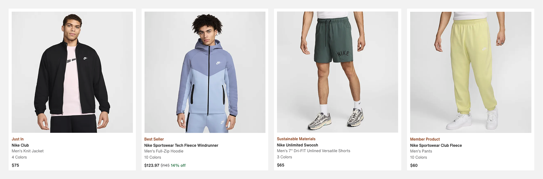
Nike’s labels include:
- “Just In”
- “Best Seller”
- “Sustainable Materials”
- “Member Product”
These micro-tags serve multiple purposes:
- Highlight key products by drawing attention to new, popular, or exclusive items.
- Signal social proof (“Best Seller”) or exclusivity (“Member Product”).
- Encourage urgency and exploration, especially when linked to sustainability or limited collections.
👉 CRO takeaway: Add meaningful product labels that reflect your audience’s priorities whether that’s popularity, newness, sustainability, or exclusivity.
Pricing Strategy: Visual Cues for Discounts
Discounts are one of the most powerful conversion levers on a product listing page and both Adidas and Nike make them impossible to miss.

Adidas:
- Crossed-out original price
- Sale price in bright red
- “–65%” label for more clarity
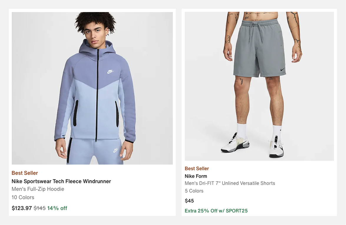
Nike:
- Crossed-out original price
- Green “14% off” badge
- Sometimes adds promo text like “Extra 25% off w/ SPORT25”
Both approaches are visually strong because they:
- Reinforce savings with multiple cues (color, strikethrough, and text).
- Use color contrast (red or green) to immediately draw the eye.
- Provide clear context for how much users save, not just what they pay.
👉 CRO takeaway: Combine color contrast + percentage saved + strikethrough pricing to make promotions unmissable. This builds perceived value and nudges users toward purchase decisions faster.
Category Page Structure: Navigation and SEO Wins
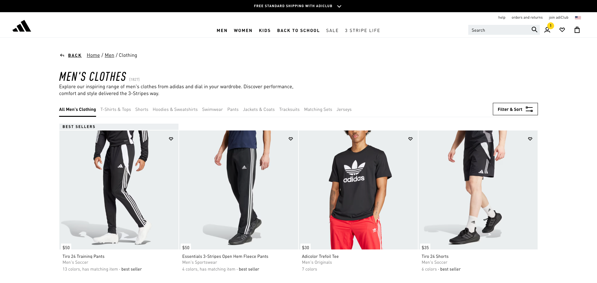
On desktop, Adidas places all subcategory links (like “T-Shirts & Tops,” “Shorts,” “Hoodies & Sweatshirts”) at the top.
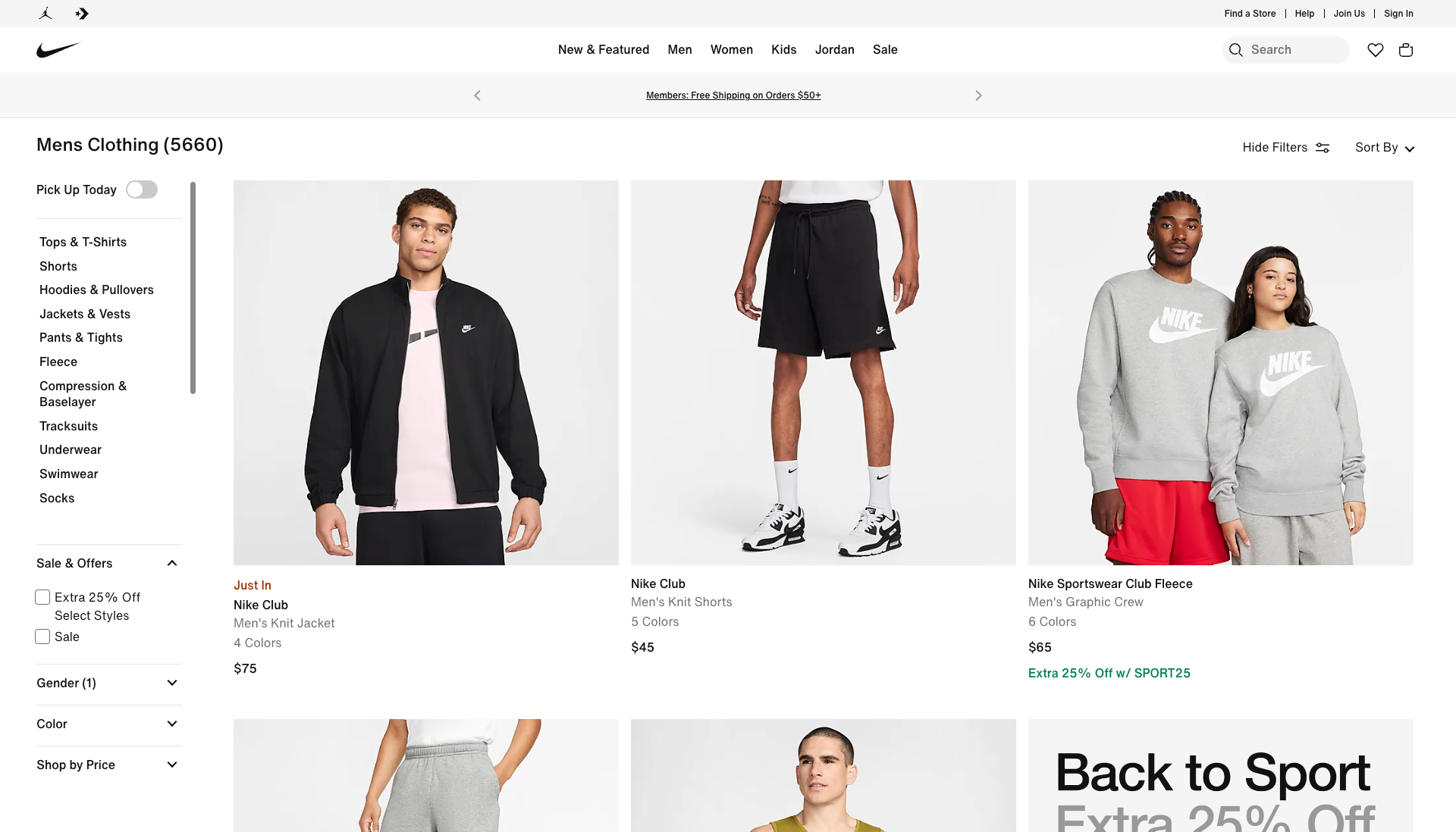
Nike opts for a left-hand filter panel.
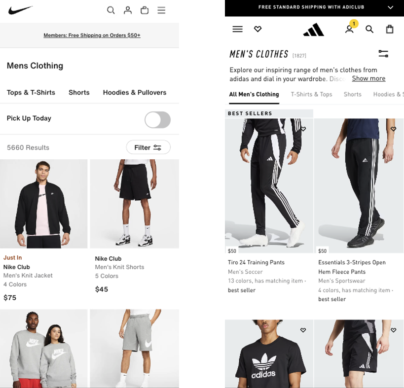
On mobile, both brands simplify navigation by allowing horizontal scrolling subcategory links.
Other Adidas strengths include:
- Breadcrumb navigation, which enhances both user orientation and SEO.
- Truncated intro text to keep products higher above the fold, a smart balance between SEO and UX.
👉 CRO takeaway: Make it easy for shoppers to find what they need without overloading the screen. Keep filters, subcategories, and breadcrumbs visible to encourage deeper browsing and better SEO indexing.
2. Product Pages: Building Confidence and Reducing Friction
Once a user clicks through to a product page, the design focus shifts from discovery to decision-making. The goal: eliminate friction and reinforce confidence.
Let’s break down what Adidas and Nike get right and how you can emulate their approach.
Visual Reinforcement and Social Proof
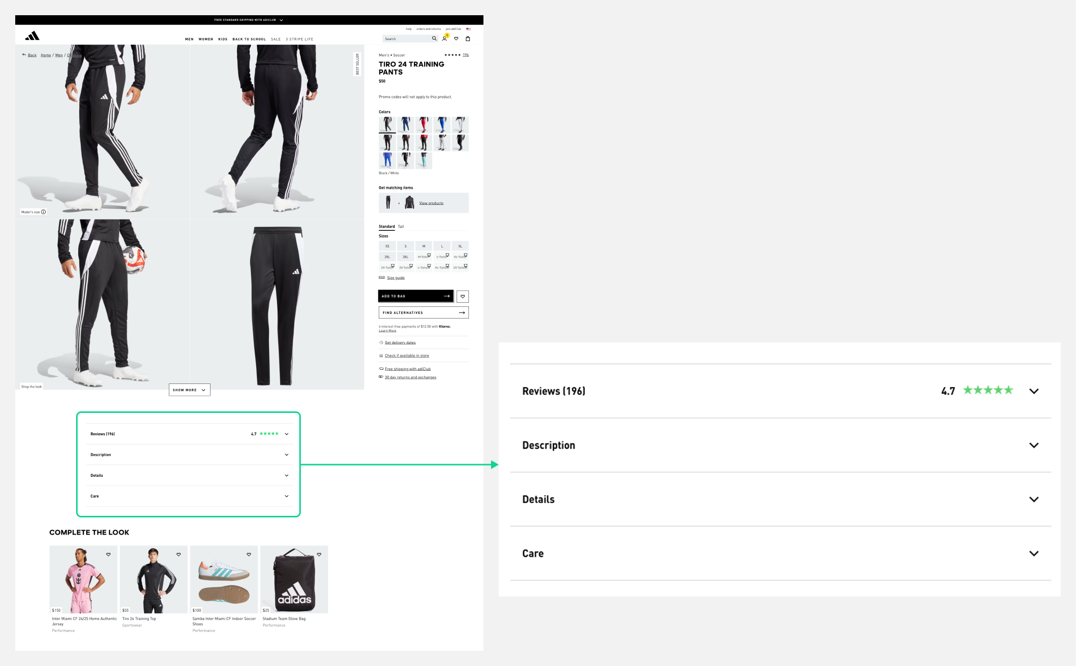
Adidas places customer reviews directly beneath the image gallery, prioritizing them over technical details. The green 5-star rating icon makes positive sentiment immediately visible.
This is a smart move, users often skim before they read, so front-loading social proof increases trust at first glance.
👉 CRO takeaway: Feature reviews and ratings closer to the product images, not buried at the bottom of the page. Visual cues like colored stars can help build credibility instantly.
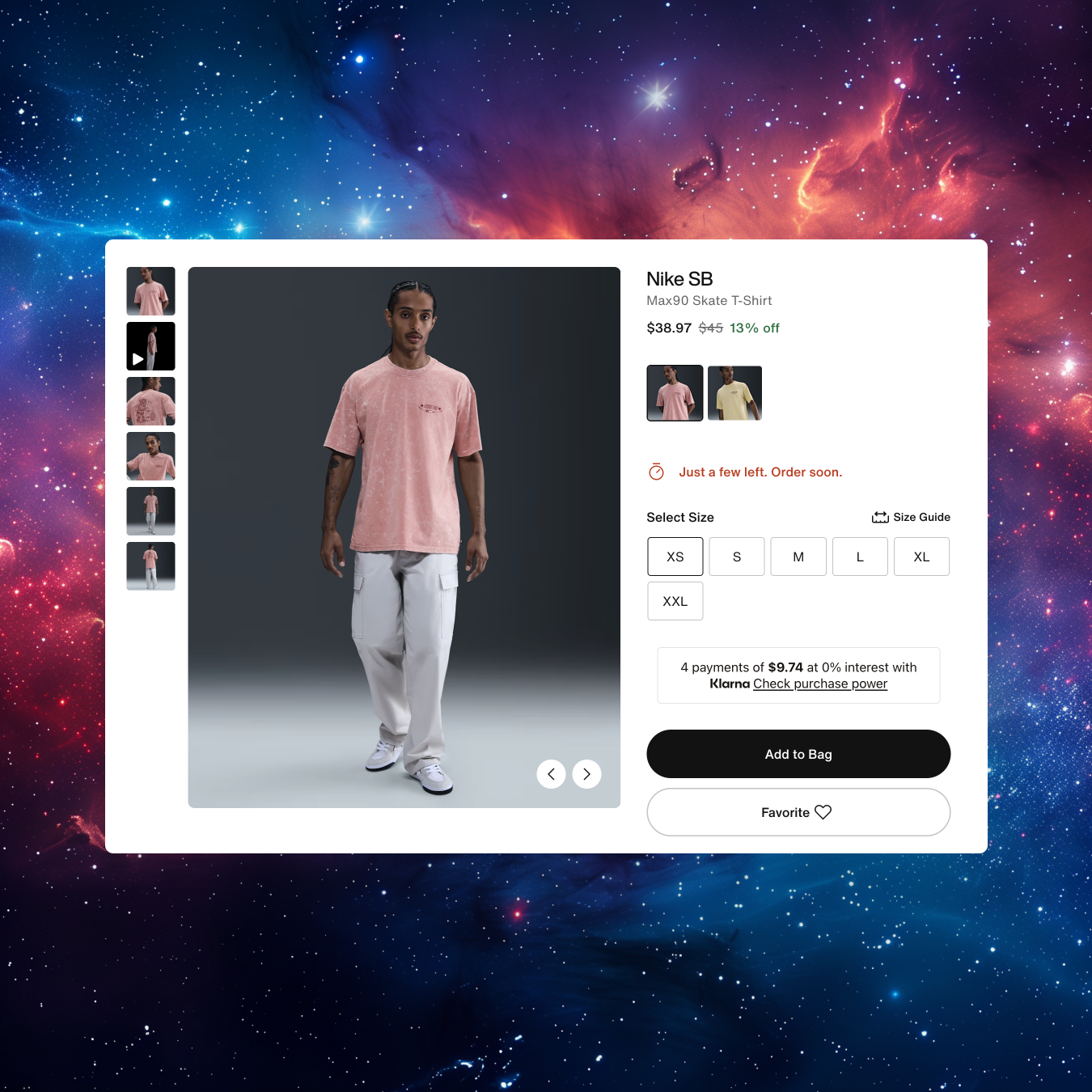
Conversion Support: Labels and Limited Stock Messaging
Just as in the listing page, Adidas and Nike use labels strategically on product pages too.
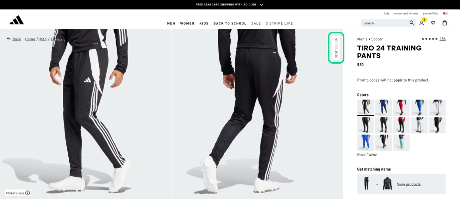
- Adidas: A “Best Seller” badge appears at the top right of the main product image.

- Nike: Uses “Just a few left. Order soon.” when stock is low, adding urgency and scarcity.

Nike also ensures that if users click “Add to Cart” without selecting a size, the page scrolls automatically to the size selector reducing user frustration and keeping the buying flow intuitive.
👉 CRO takeaway: Use microcopy and motion cues to guide users smoothly through the purchase process. Small automations, like auto-scrolling, can significantly reduce bounce rates and drop-offs.
Sticky CTAs on Mobile
Nike’s mobile experience includes a sticky “Add to Bag” button, keeping the call-to-action visible at all times. For mobile users, this is crucial, they scroll far more than desktop users, and a static CTA often disappears off-screen.
👉 CRO takeaway: Implement sticky CTAs on mobile product pages to reduce friction and maintain a clear path to conversion. It’s a simple but high-impact UX pattern.
Transparency Around Delivery and Returns
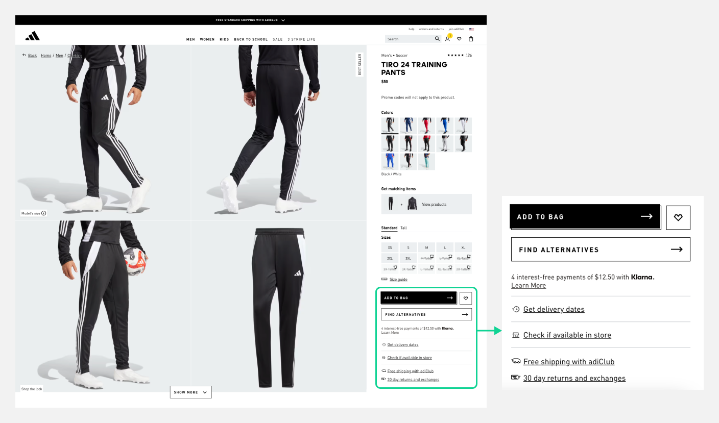
Under the main CTA, Adidas includes delivery details and key USPs like:
- Free shipping
- 30-day returns
- Icons to visually represent these benefits
This approach reassures users and tackles common ecommerce objections (“How long will shipping take?” “Can I return it?”).
👉 CRO takeaway: Reinforce post-purchase reassurance directly under your CTA. Use icons for readability and visual trust.
Product Discovery Beyond the Page: Cross-Selling
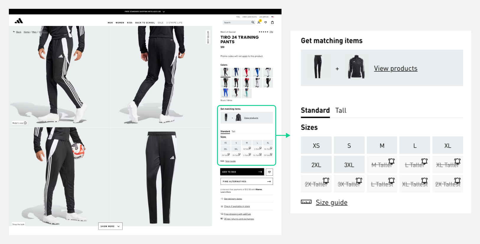
Adidas integrates a “Get Matching Items” module in the right-hand sticky panel, a form of contextual cross-selling that doesn’t interrupt the main buying process.
This allows users to build an outfit or set without leaving the page, effectively increasing average order value (AOV).
👉 CRO takeaway: Add contextual product recommendations (e.g., “Complete the look”) within the product page flow. Keep it relevant and visually aligned with the main product.
Smart Size Interaction Design
Adidas’ size guide is placed directly below the size selector, exactly where users need it. When a size is sold out, a bell icon appears, allowing users to get notified when it’s back in stock.
Both features help maintain user engagement and prevent abandonment.
👉 CRO takeaway: Always keep key size, stock, and notification elements visible and interactive. Anticipate user frustrations (like out-of-stock sizes) and provide an immediate solution.
3. Applying These Insights to Your Ecommerce Site
To apply these lessons effectively, consider running A/B tests on key product page elements:
- Test price formatting: Compare a single sale price vs. full price + % off badge.
- Experiment with review placement: Above vs. below product details.
- Try urgency triggers: Time-limited stock messages vs. none.
- Add or test sticky CTAs: On mobile and desktop.
- Cross-sell location: In sticky side panel vs. below main product info.
By measuring click-through rates (CTRs), conversion rates, and average order value (AOV), you can identify which patterns drive the most impact for your customers.
4. Final Thoughts
Apparel ecommerce is about more than beautiful photography. It’s about confidence, clarity, and momentum. The most successful product pages don’t overwhelm; they guide, reassure, and persuade subtly through design and interaction.
Nike and Adidas set a strong standard in this space, but their tactics are adaptable to any brand. With thoughtful UX, strong CRO principles, and continuous testing, your product pages can deliver both seamless user experiences and measurable business results.
Want to optimize your ecommerce product pages?
At KARL Mission, we help brands transform their online stores through data-driven CRO and UX design.
Book a free consultation to learn how to improve your product experience and grow conversions.
Book a Free Website Consultation
Discover quick wins for your digital strategy. 100% guaranteed.